AeroPress
Offwhite Co:
Michael DelPup
Ross Palumbo
Caitlin Kachmar
Audrey Krumenacker
AeroPress began with it’s founder Alan Adler. You might recognize the name, Alan is also the inventor of the toys under the Aerobie brand. Through the years AeroPress popularity grew and had amassed a cult following. They’ve expanded the globe since it’s inception and are celebrated through coffee brewing competitions annually. If you’re a caffeine addict or even a moderate coffee enthusiast, you might recognize the name AeroPress.
It was time for an update, from AS seen on TV to the stand out go-to for all coffee aficionados. Something that keeps the history alive but also brings the design into the contemporary age. The trick is, how do you do all of that without alienating the already beloved product and accustomed design?
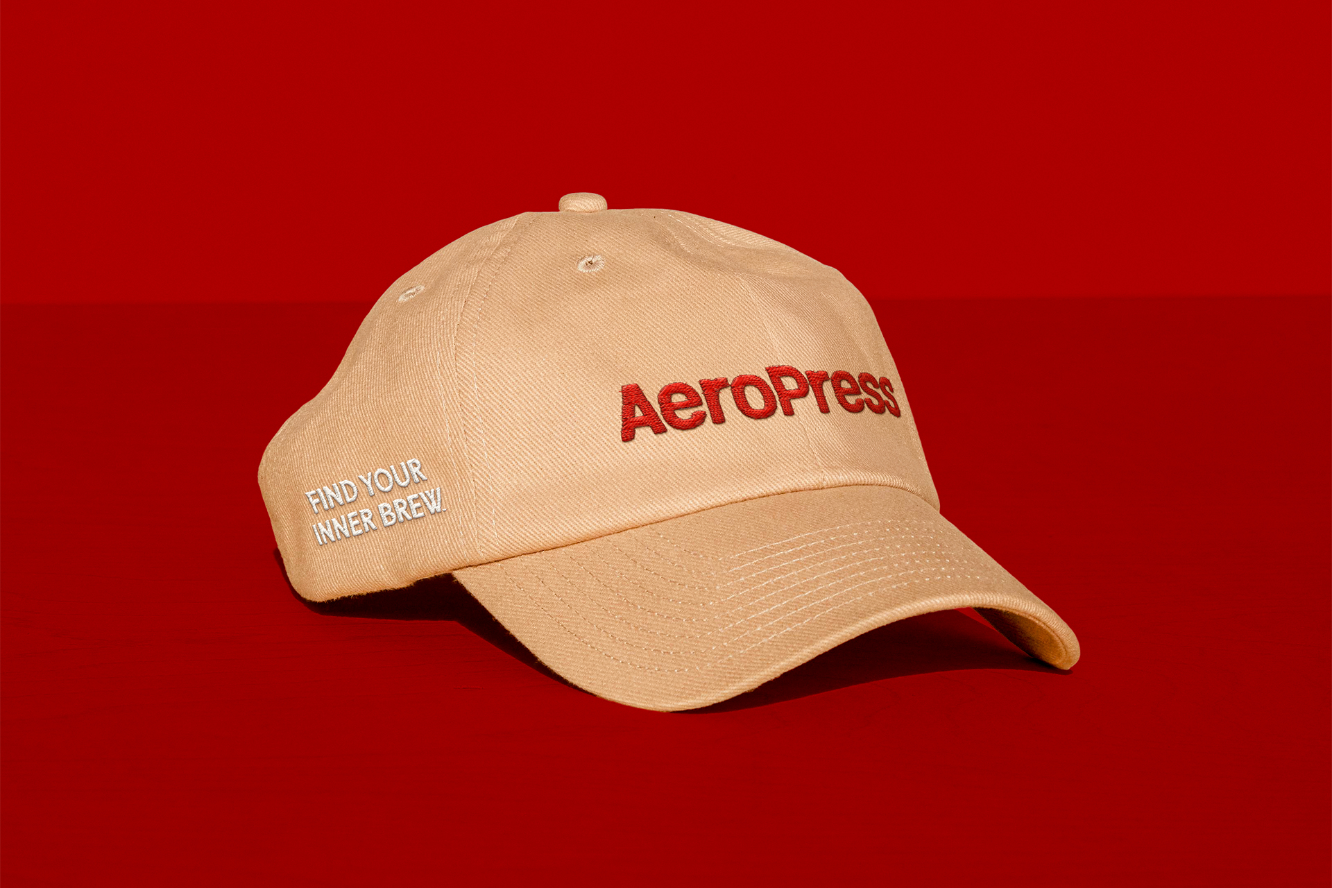
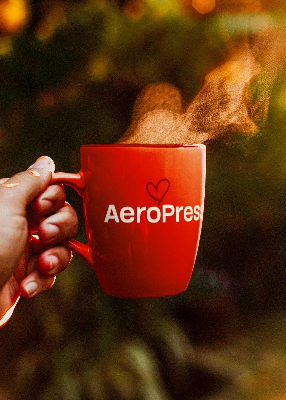
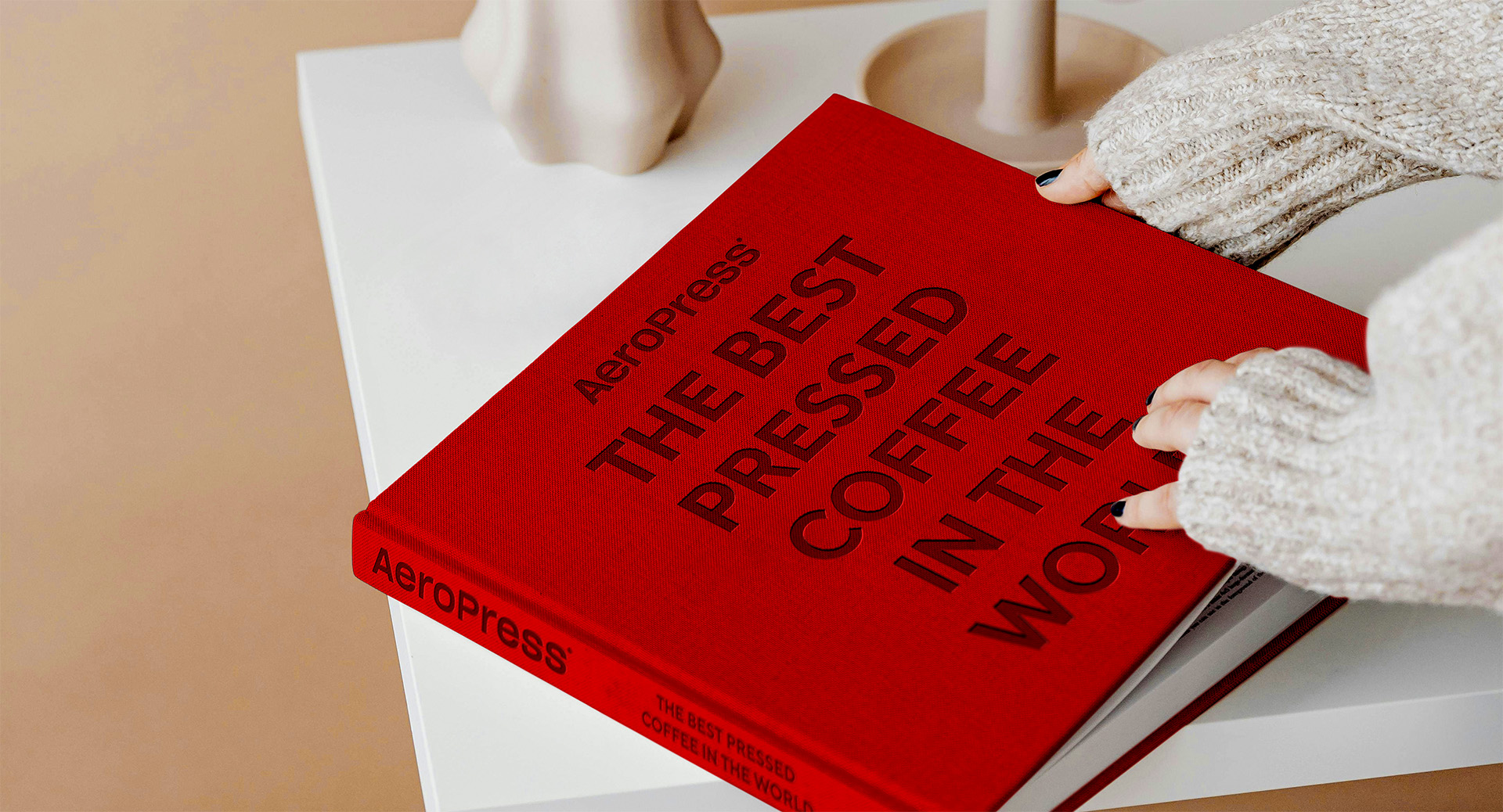
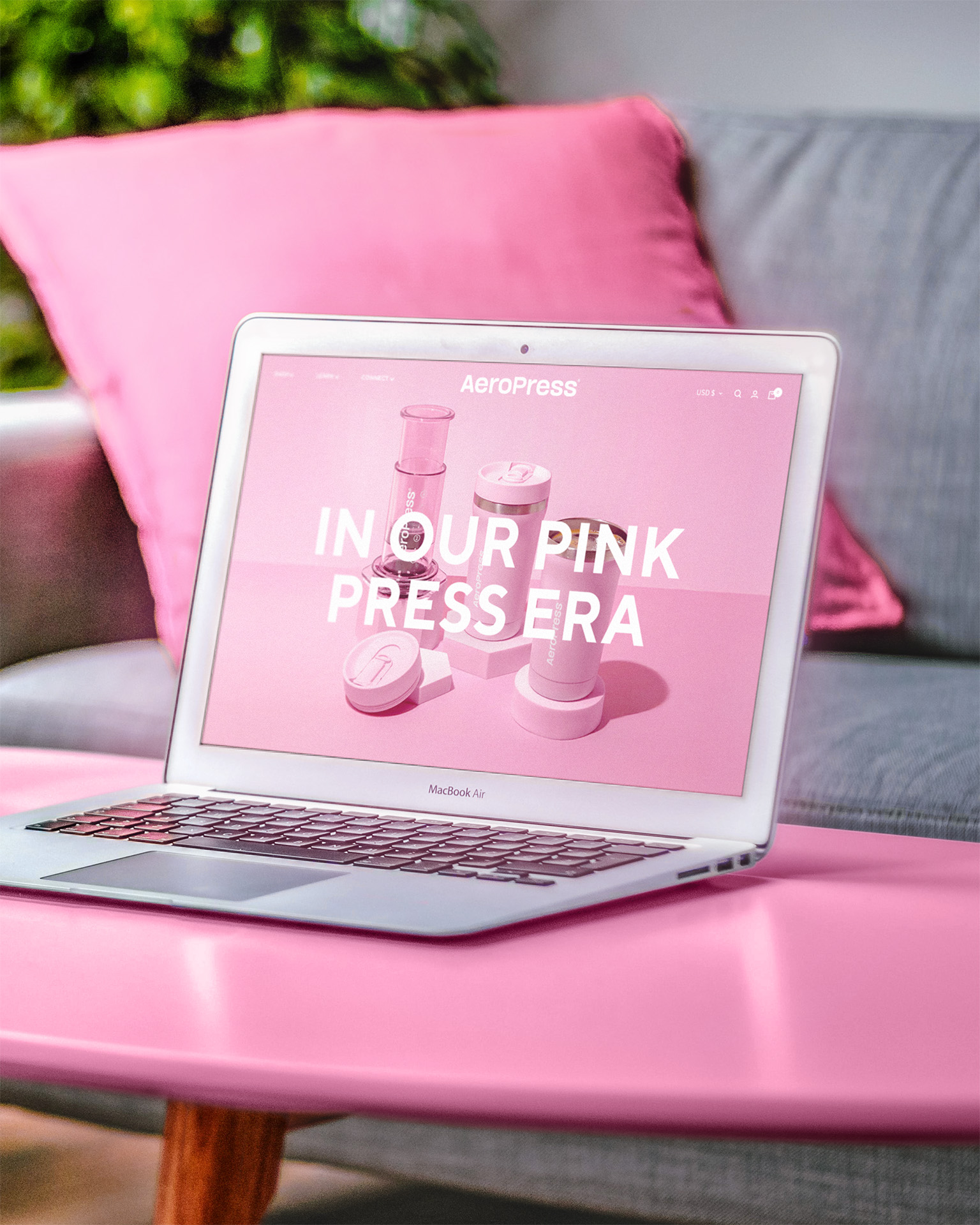
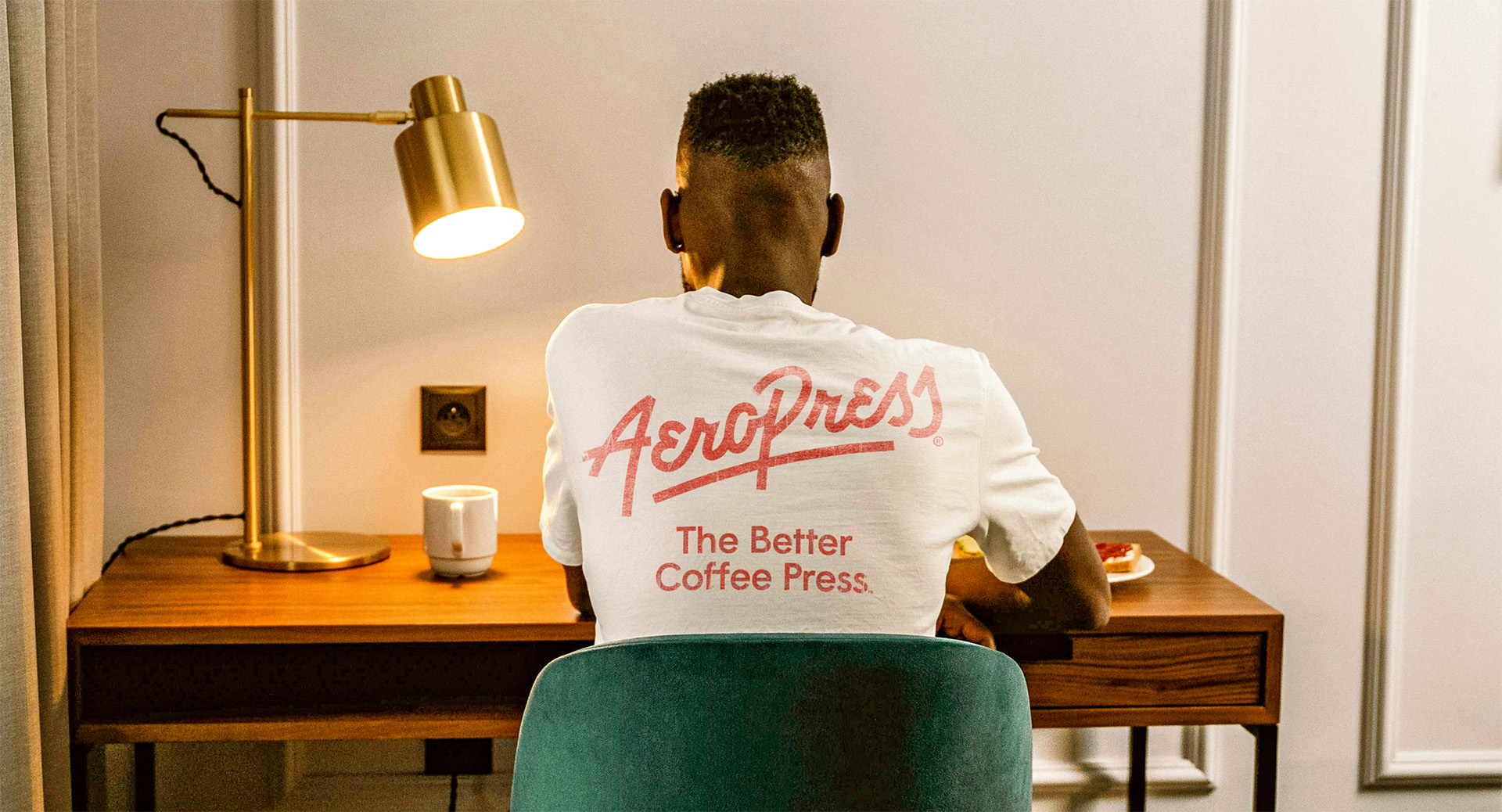
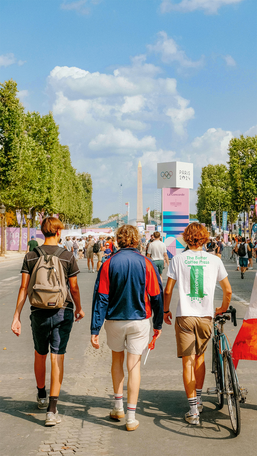
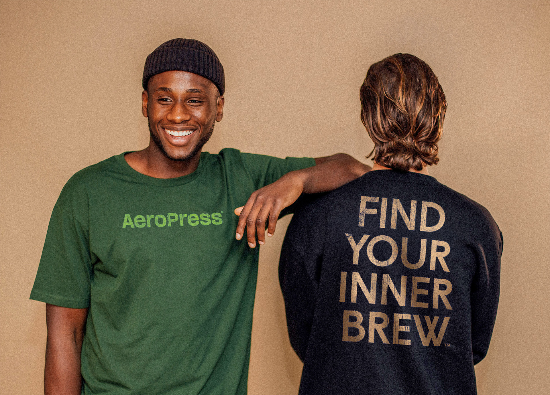
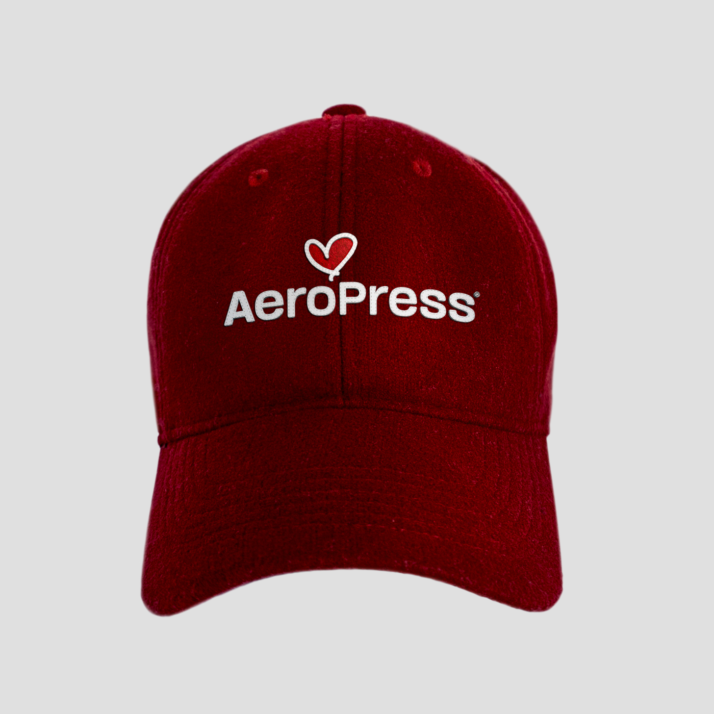
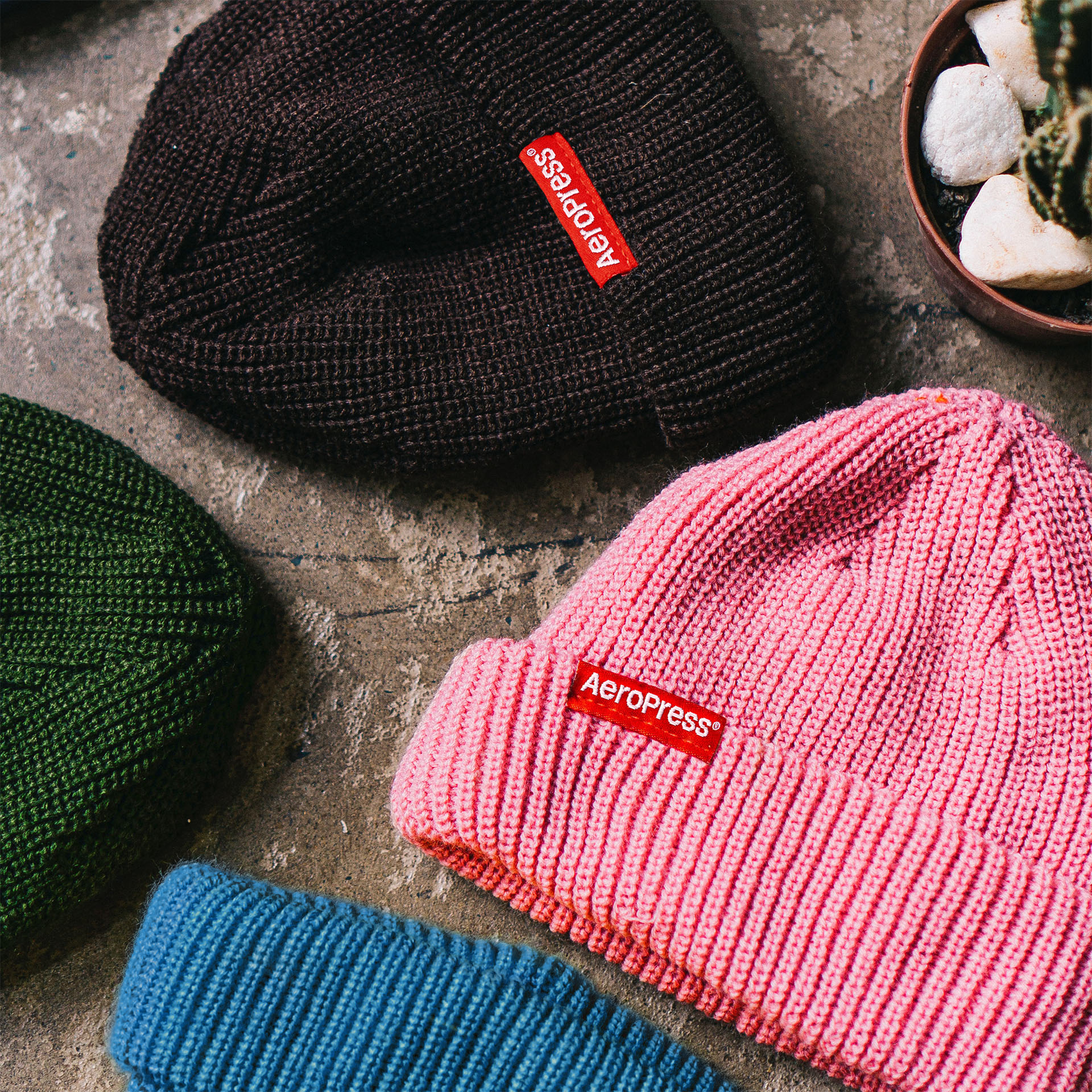
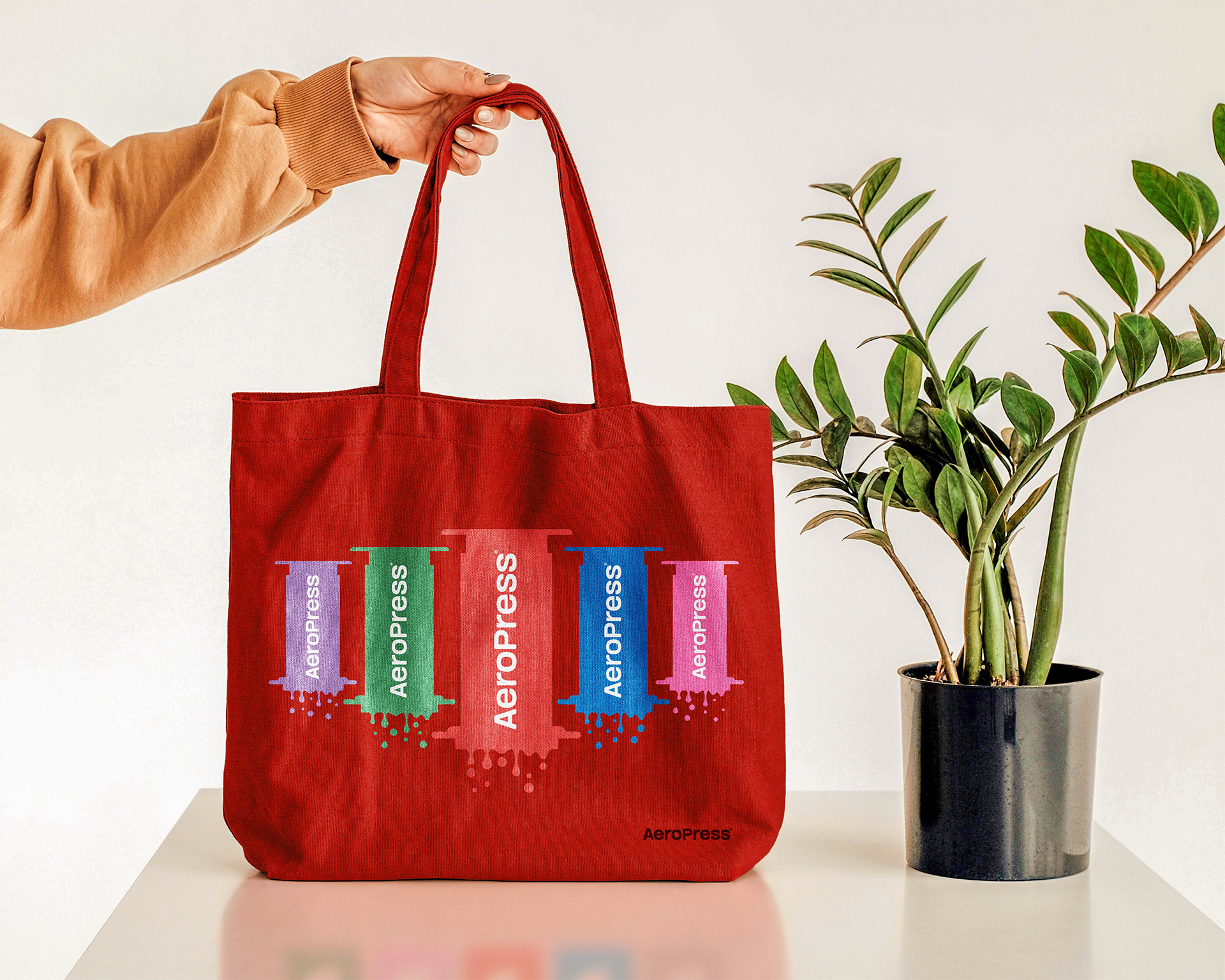
MDD continued the brand system by adding to the current designs, updating the typography, editing all photography, creating new ad campaigns and mocking up designs on all OOH environments and branded swag.
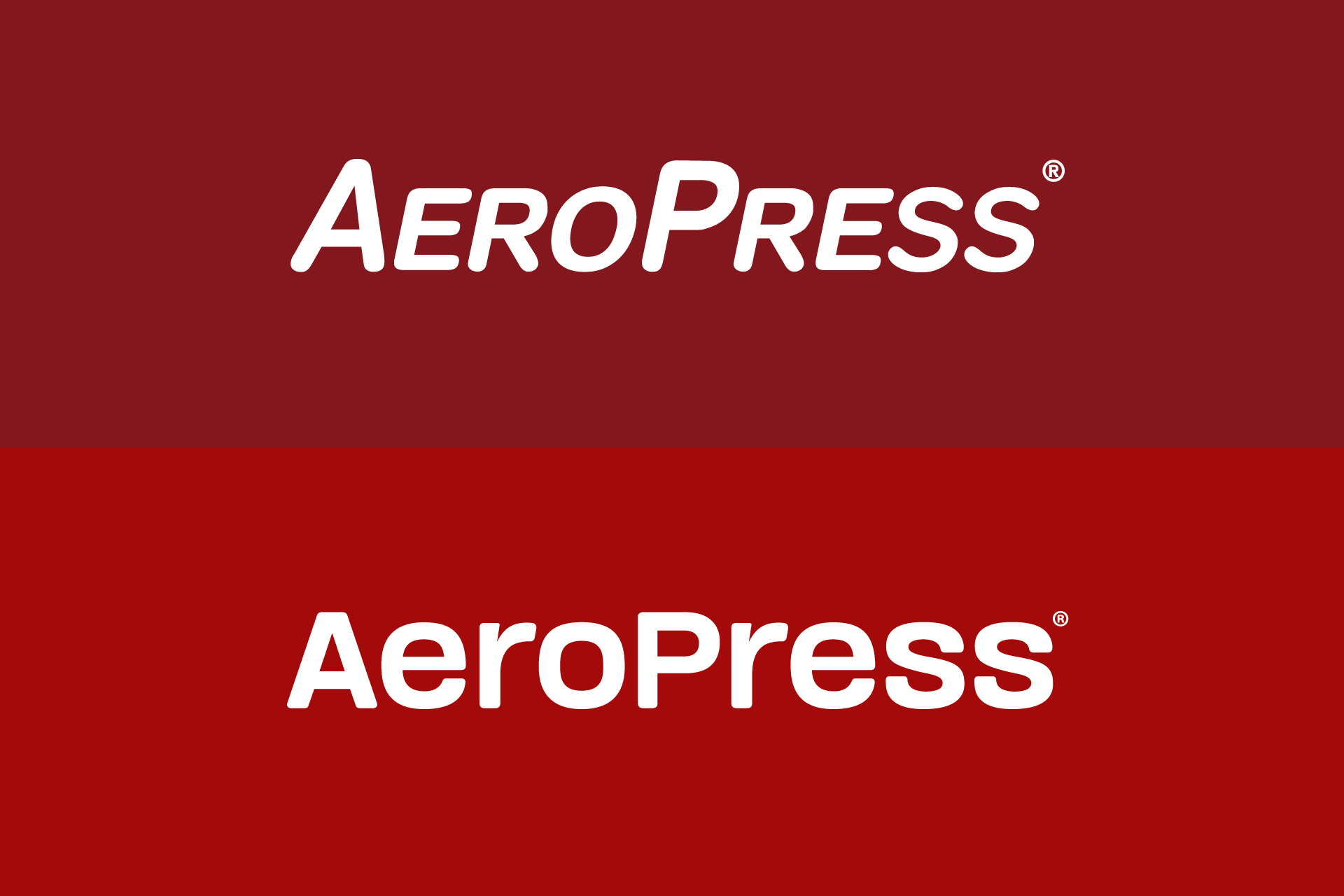
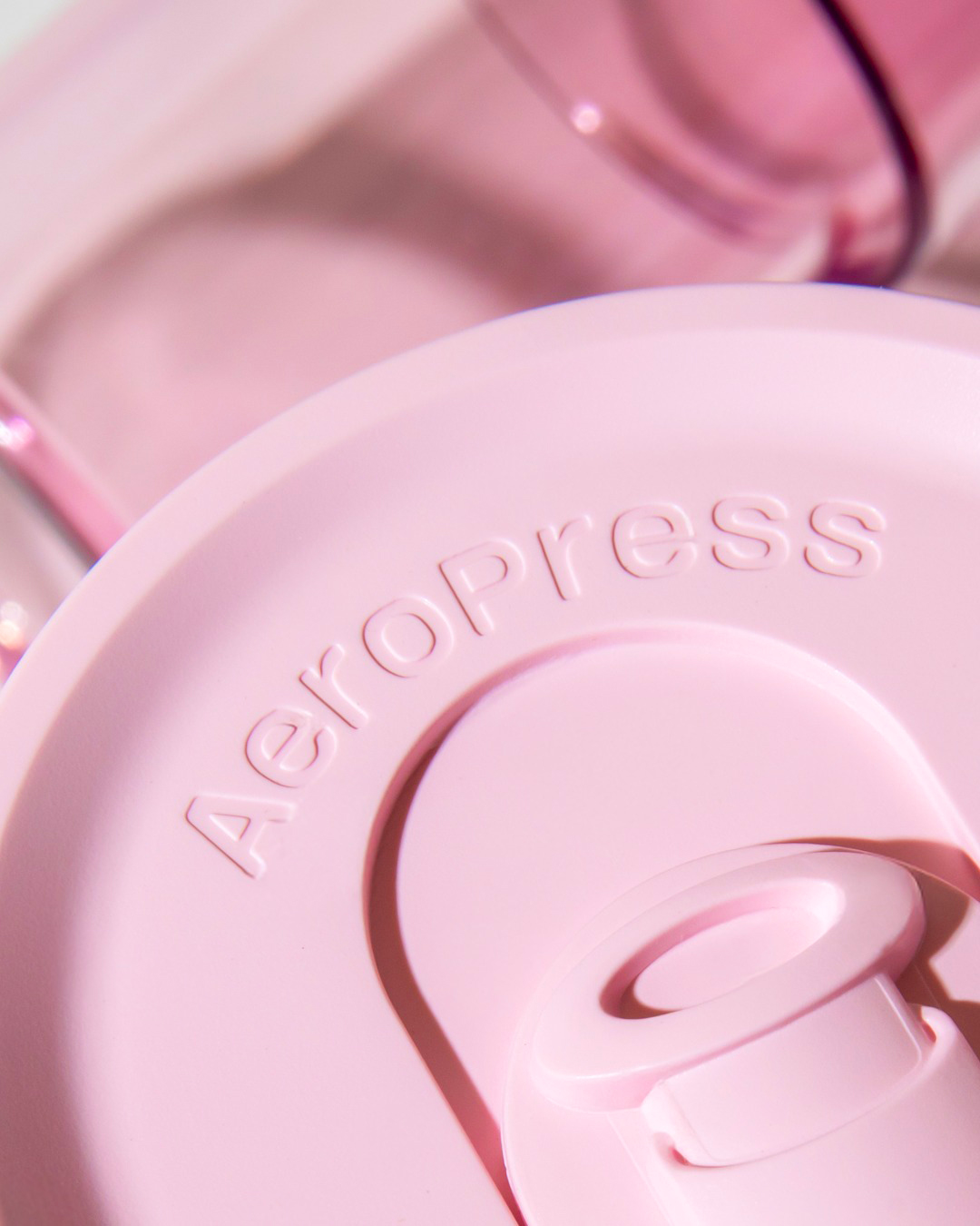
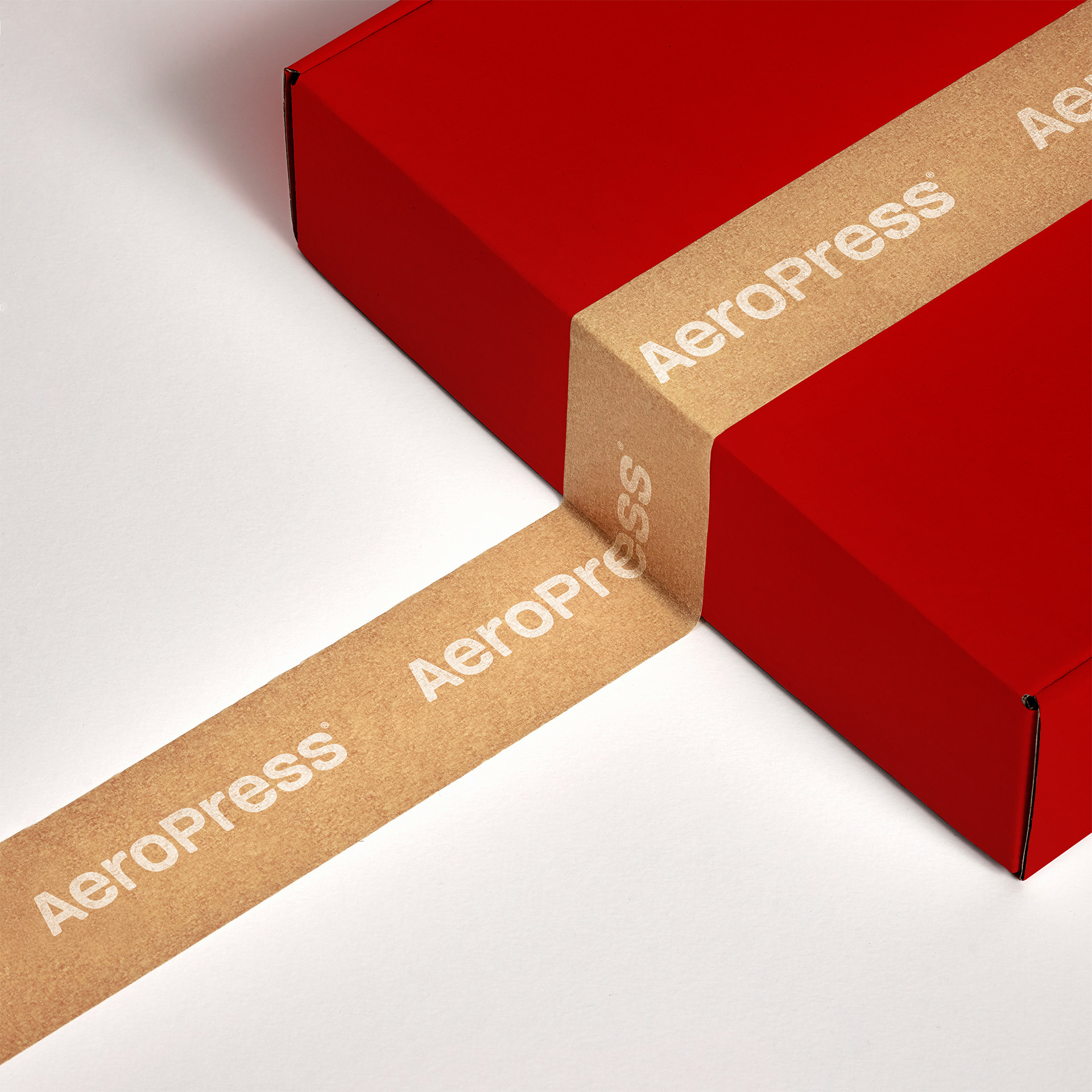
Updating the logotype to stand up straight and be more structured with rounded corners, indicative of the edging of the coffee maker itself, pays homage to the previous logo which was completely rounded. The iconic red from their past brand system needed a little push into a brighter more saturated red, and in doing so we were able to turn this into the main brand color seen throughout most of the original packaging.
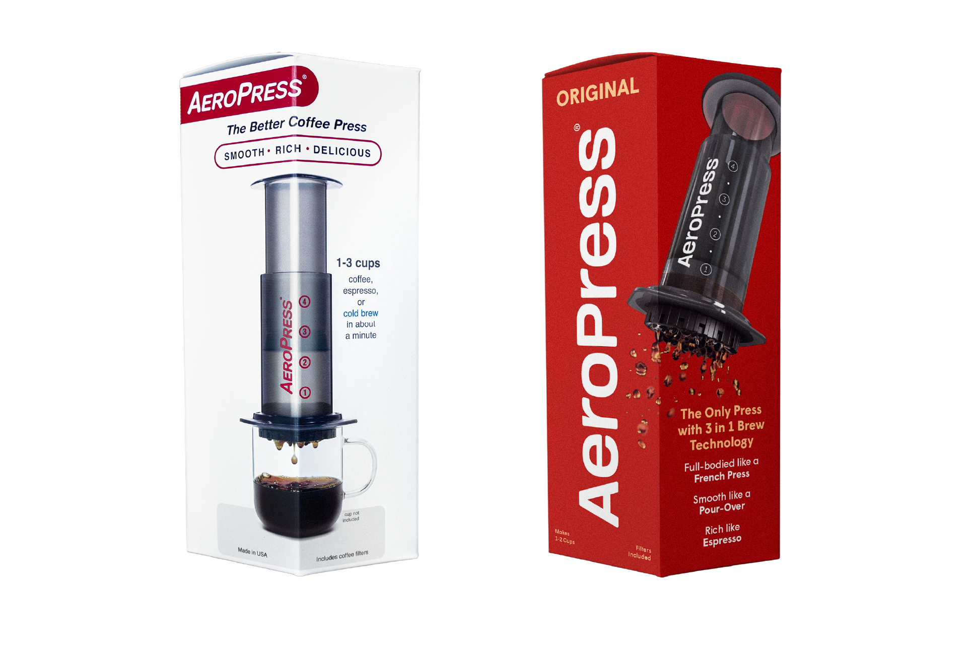
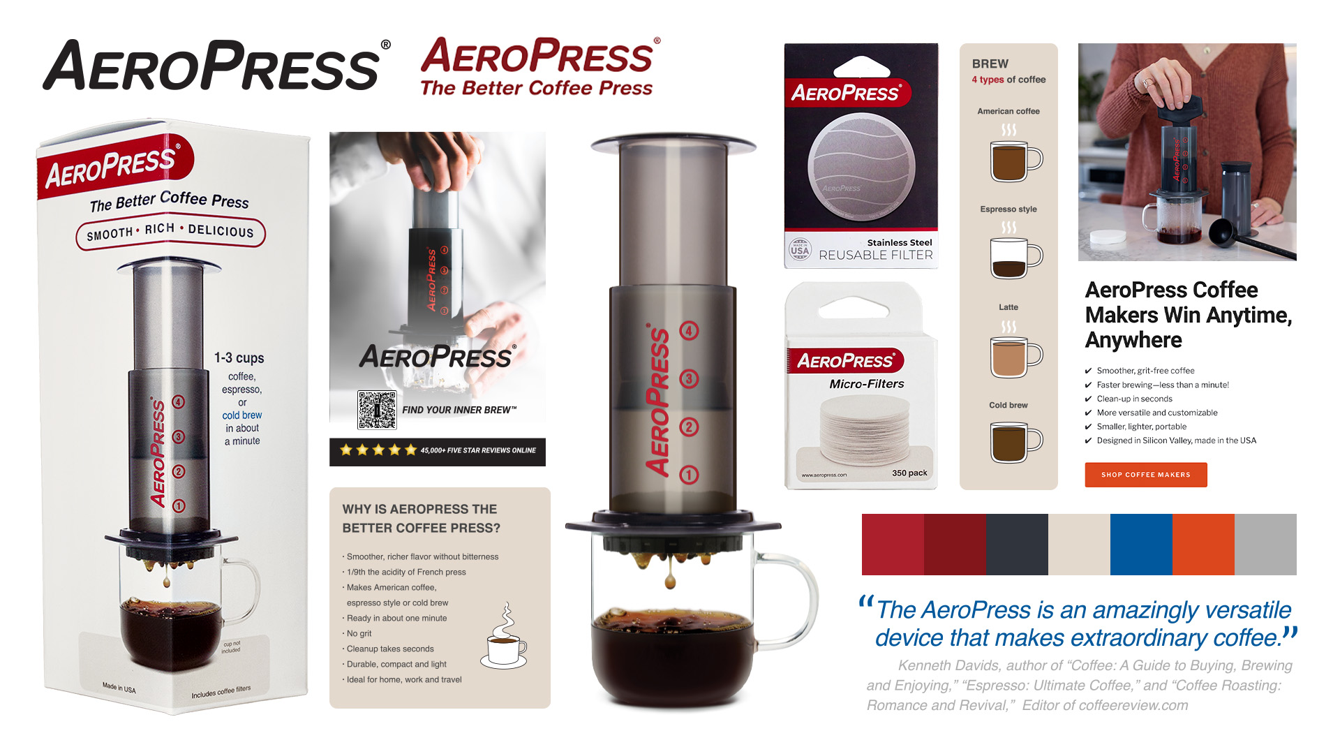
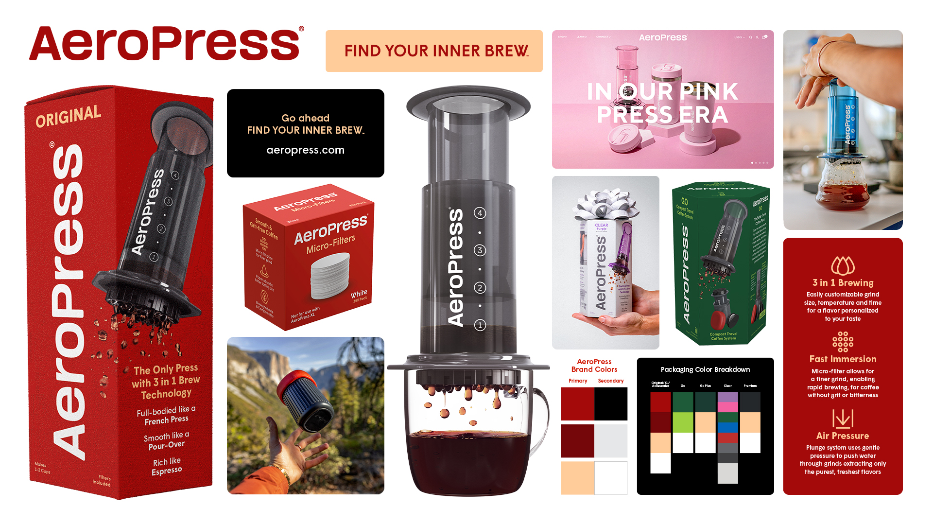
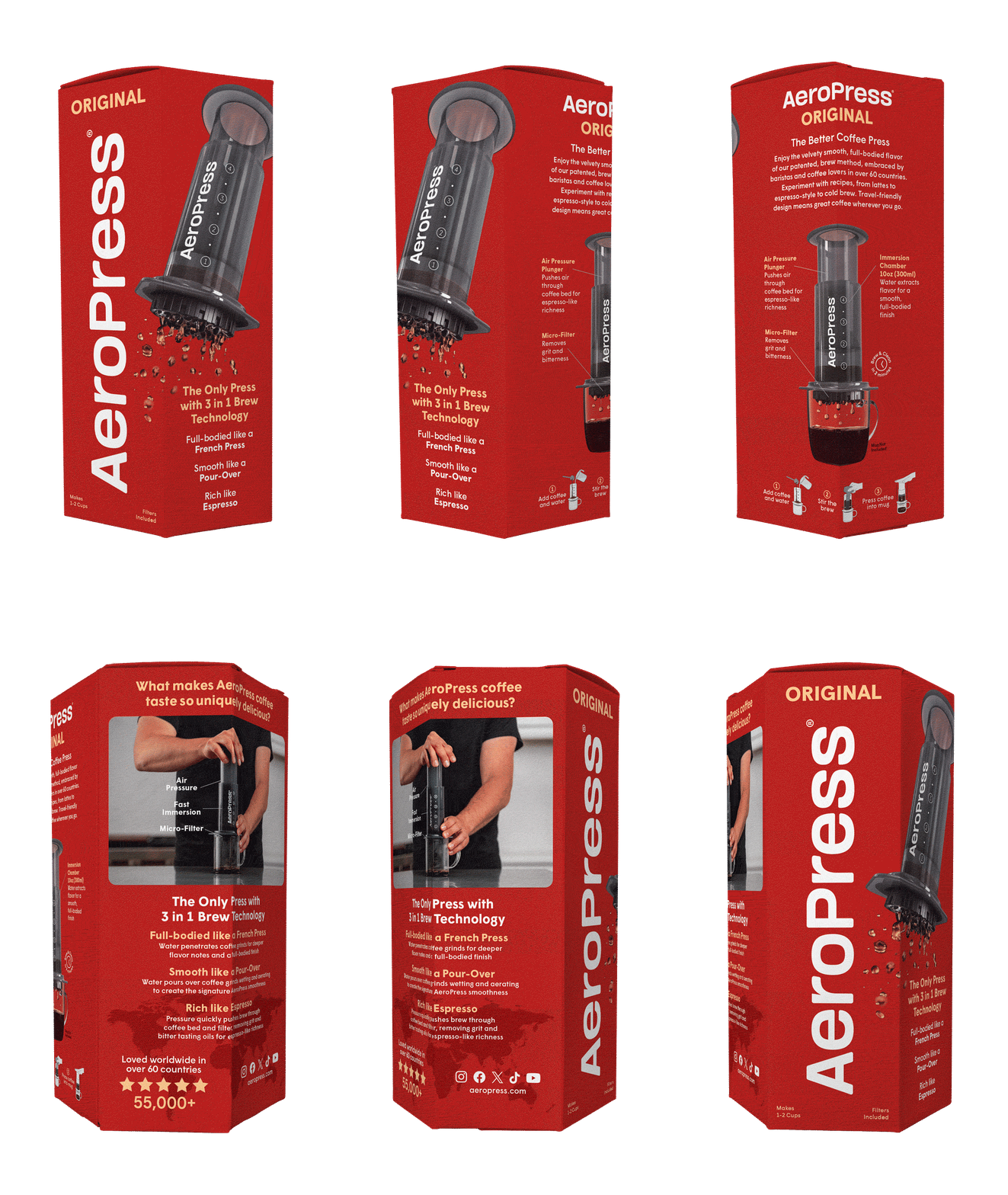
The popularity and affection this coffee maker amassed over the years deserved a refresh to match its uniqueness, energy, and special nature. Now that AeroPress itself is a well known way of making coffee in the coffee community, we felt there was a need to do a complete update for the feeling and design when it came to the brand and all the products offered.
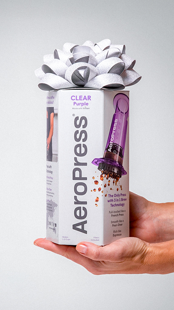
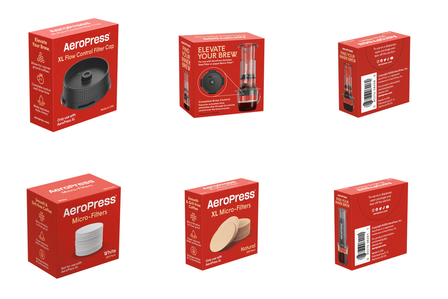
Simplification was one of our main goals for all of the AeroPress packs and accessories. Through the use of imagery, diagram breakdowns, and calling out specific key features we were able to remove unnecessary paragraphs of information and bring some liveliness to this quick, easy, and delicious producing coffee maker.
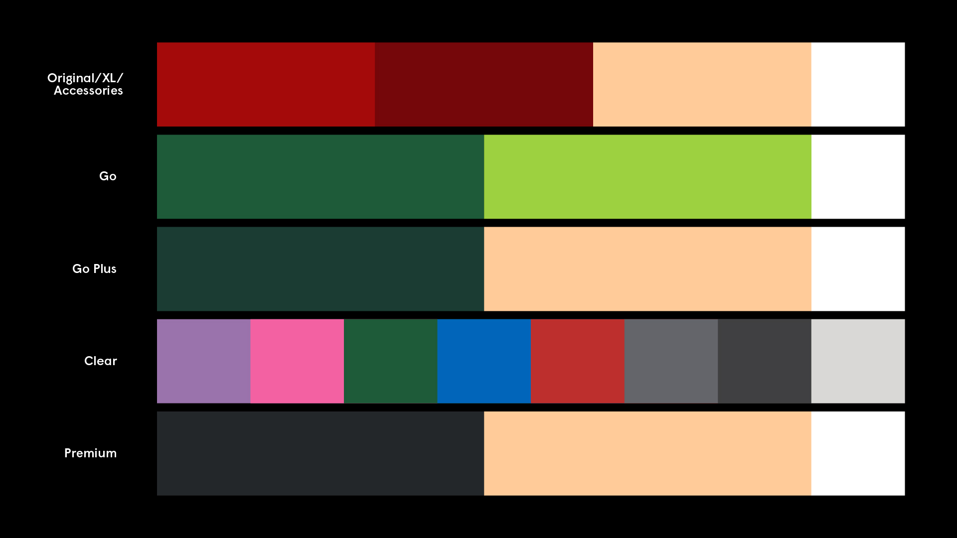
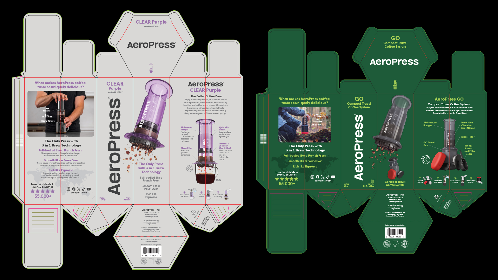
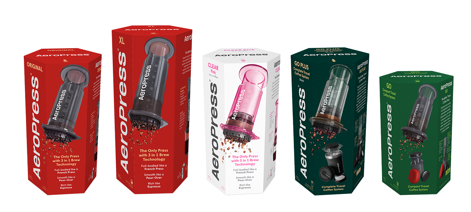
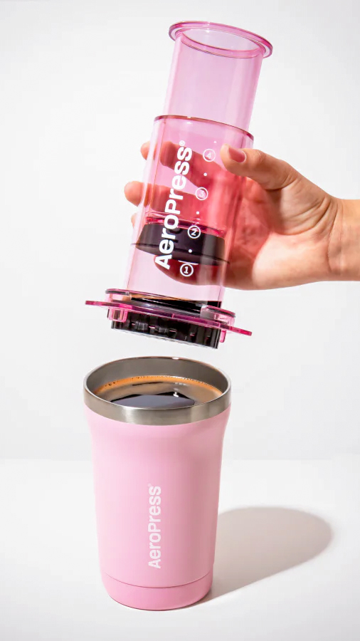
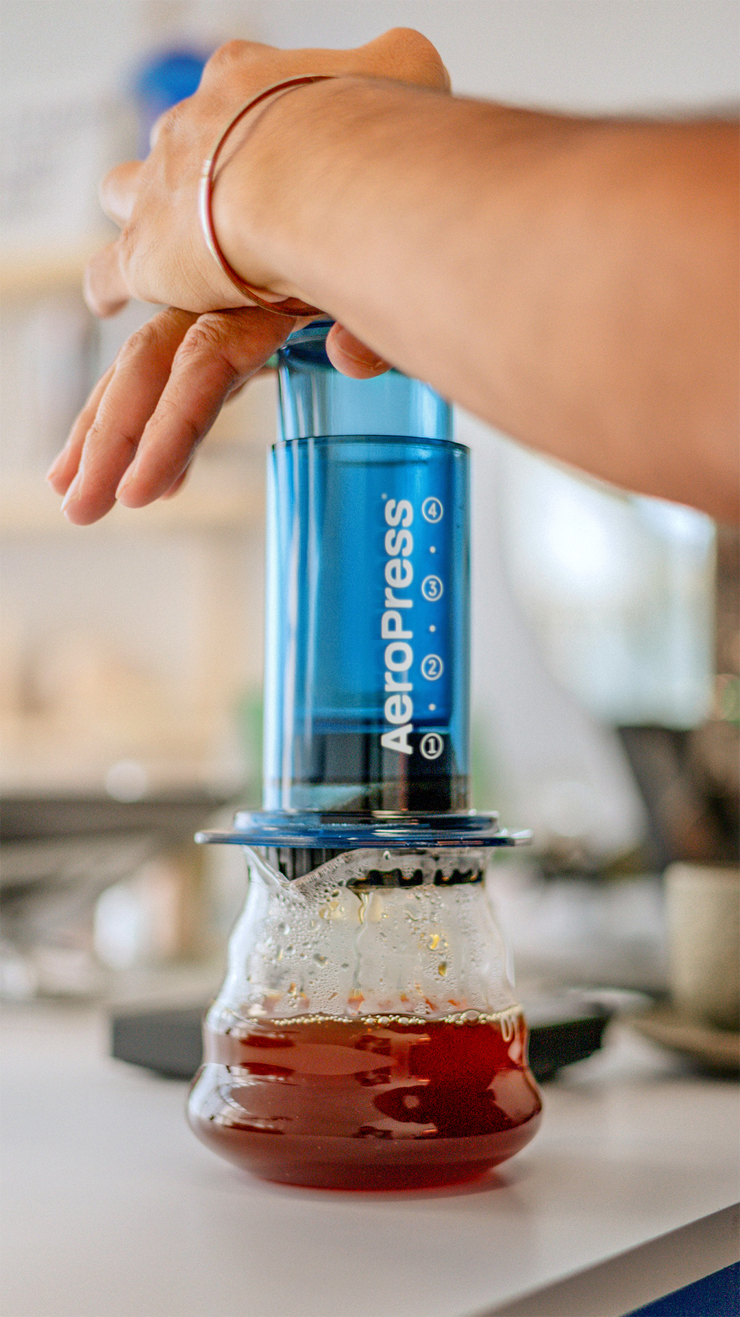
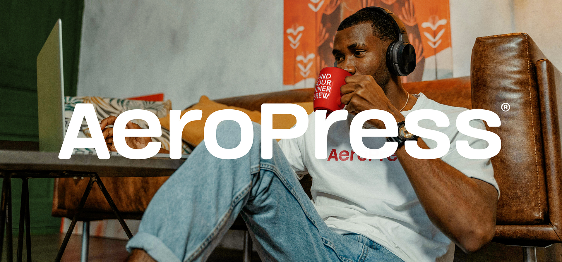
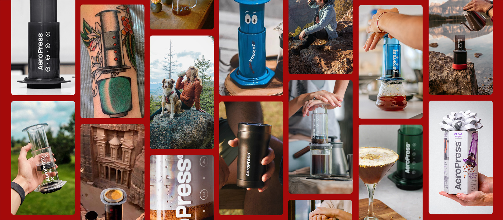
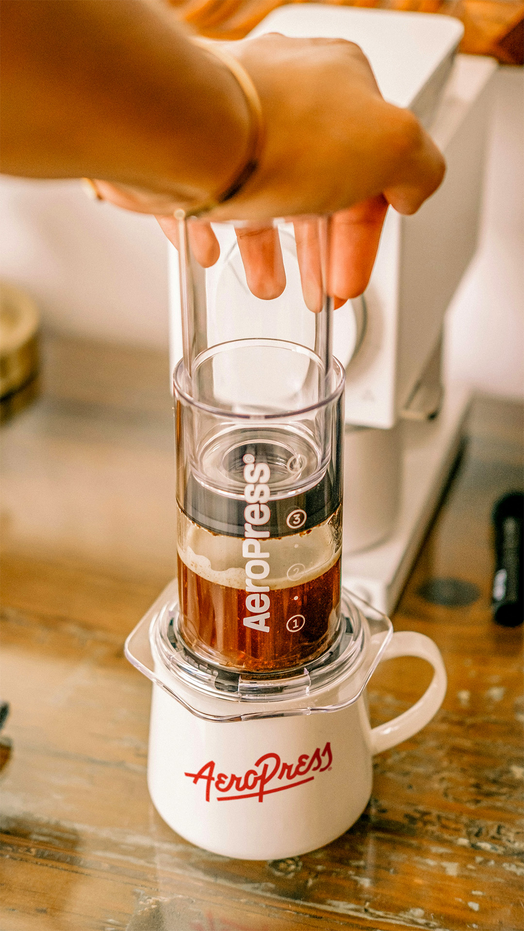
The imagery on the front of the main packs and other digital collateral needed an update from its generic stock style to a more energetic, warm, and inviting tone especially when handling the new line of clear color coffee makers. Along with utilizing more of the beautiful UGC from the massive amount of AP fans in the coffee community, showing different uses and locations people are pressing their favorite cup.
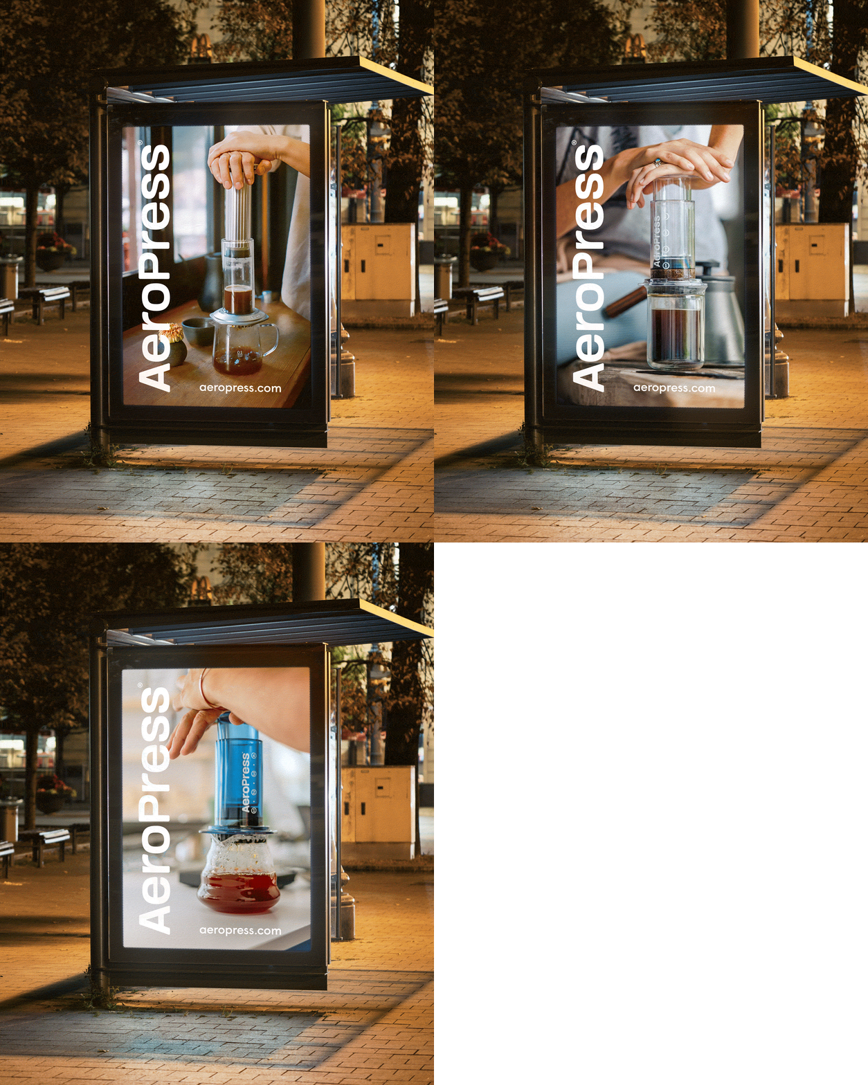
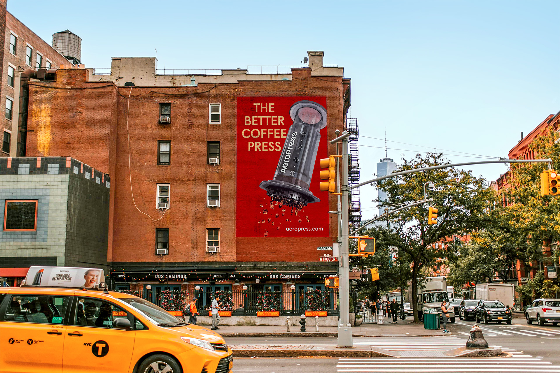
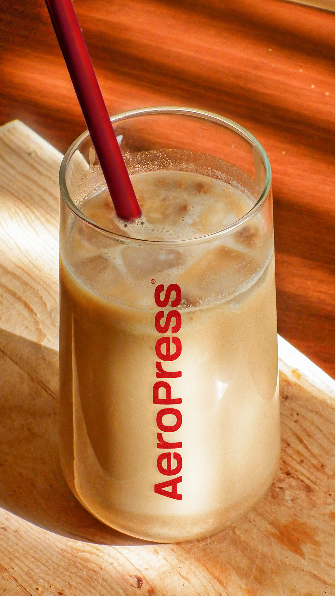
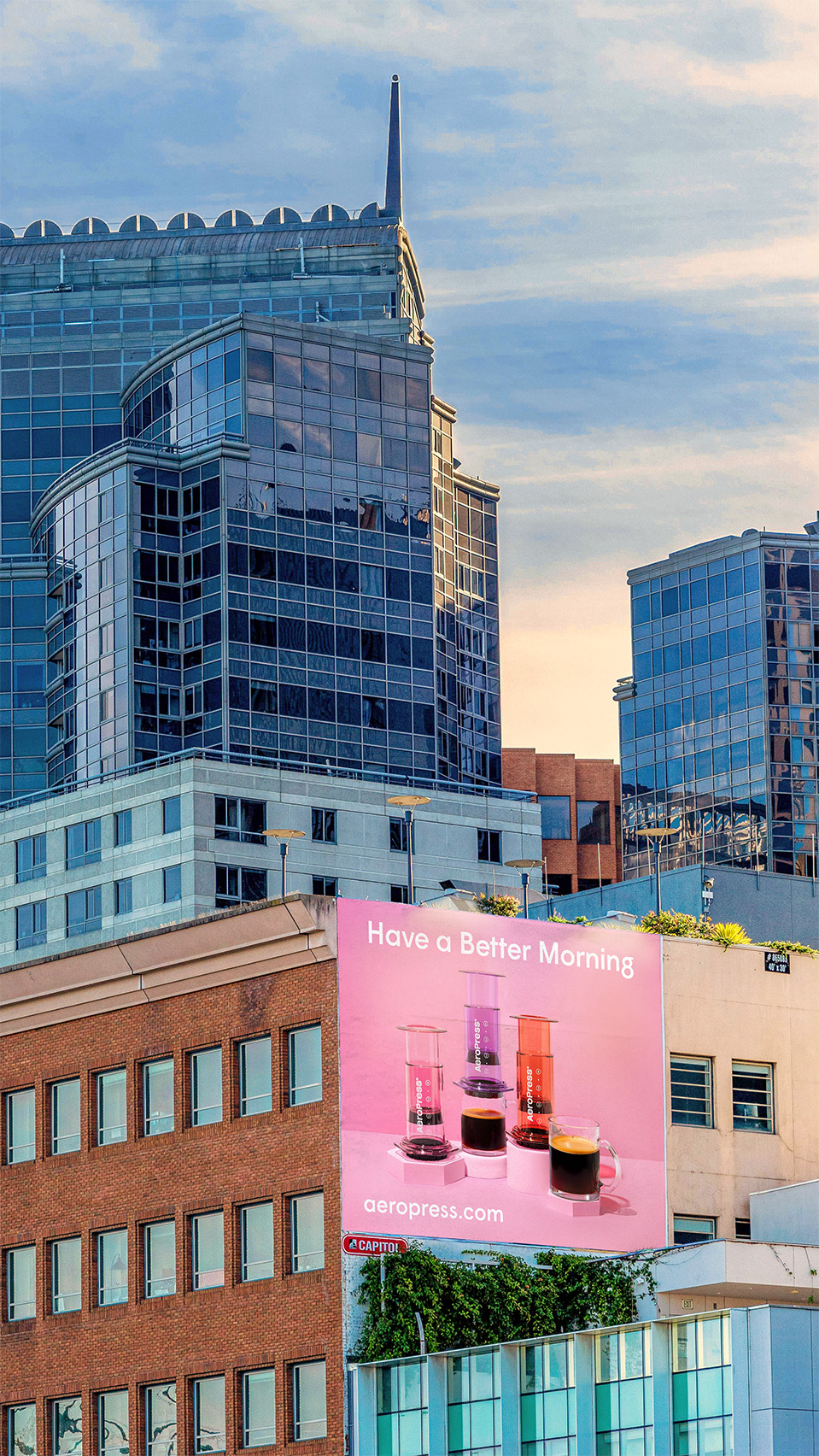

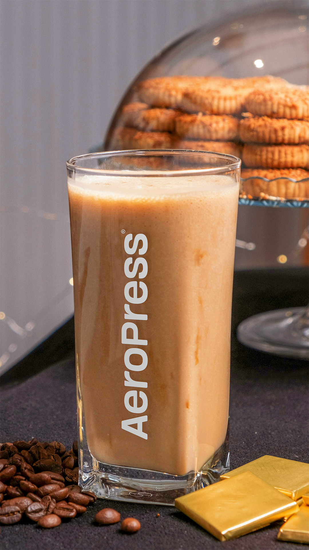
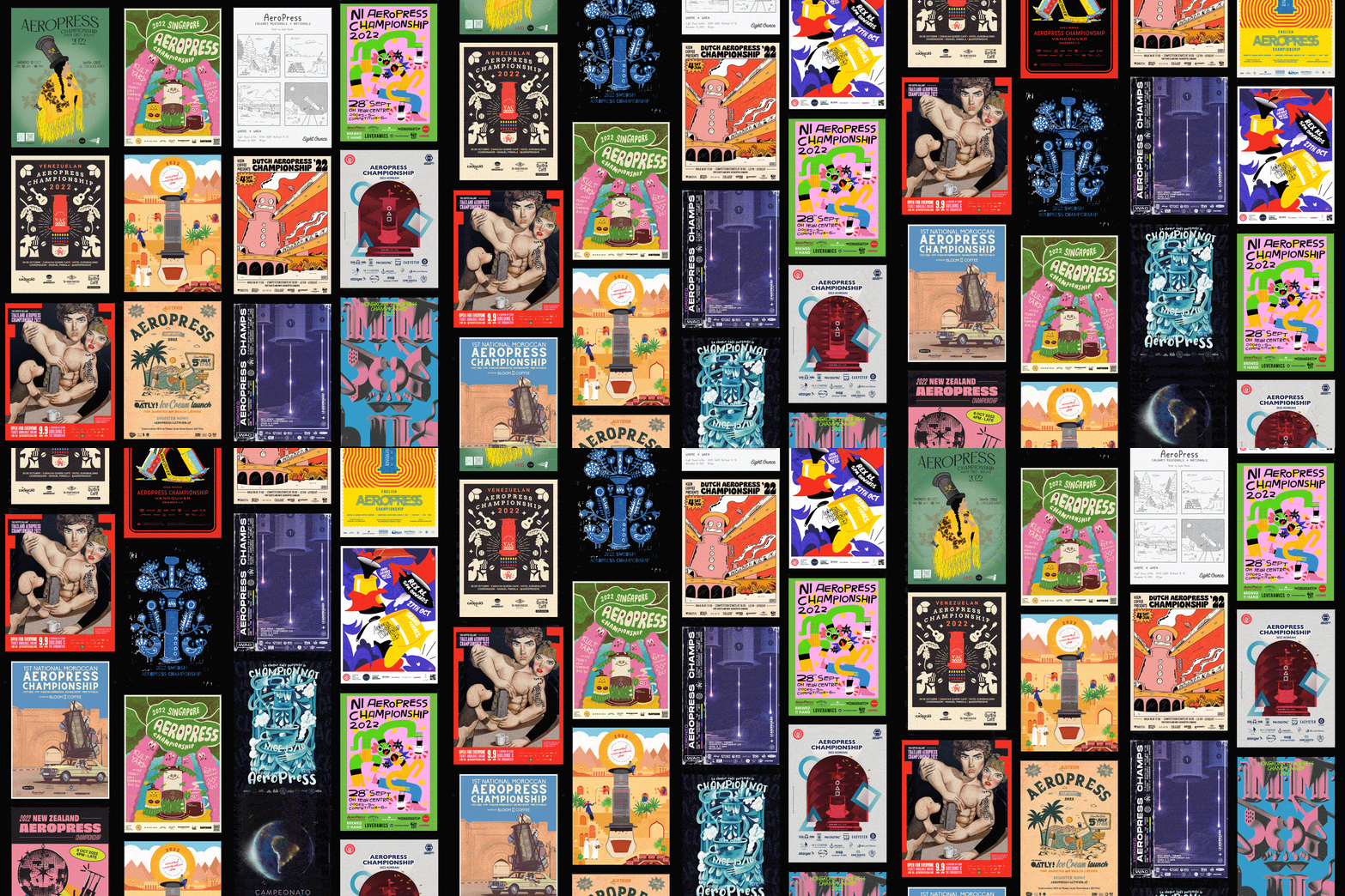
I’d be remiss without mentioning the wonderful poster art from all over the world. Countless styles, amazing artists, and unique cultures, that found their own way into the international fandom of AeroPress.
Comfort Collection
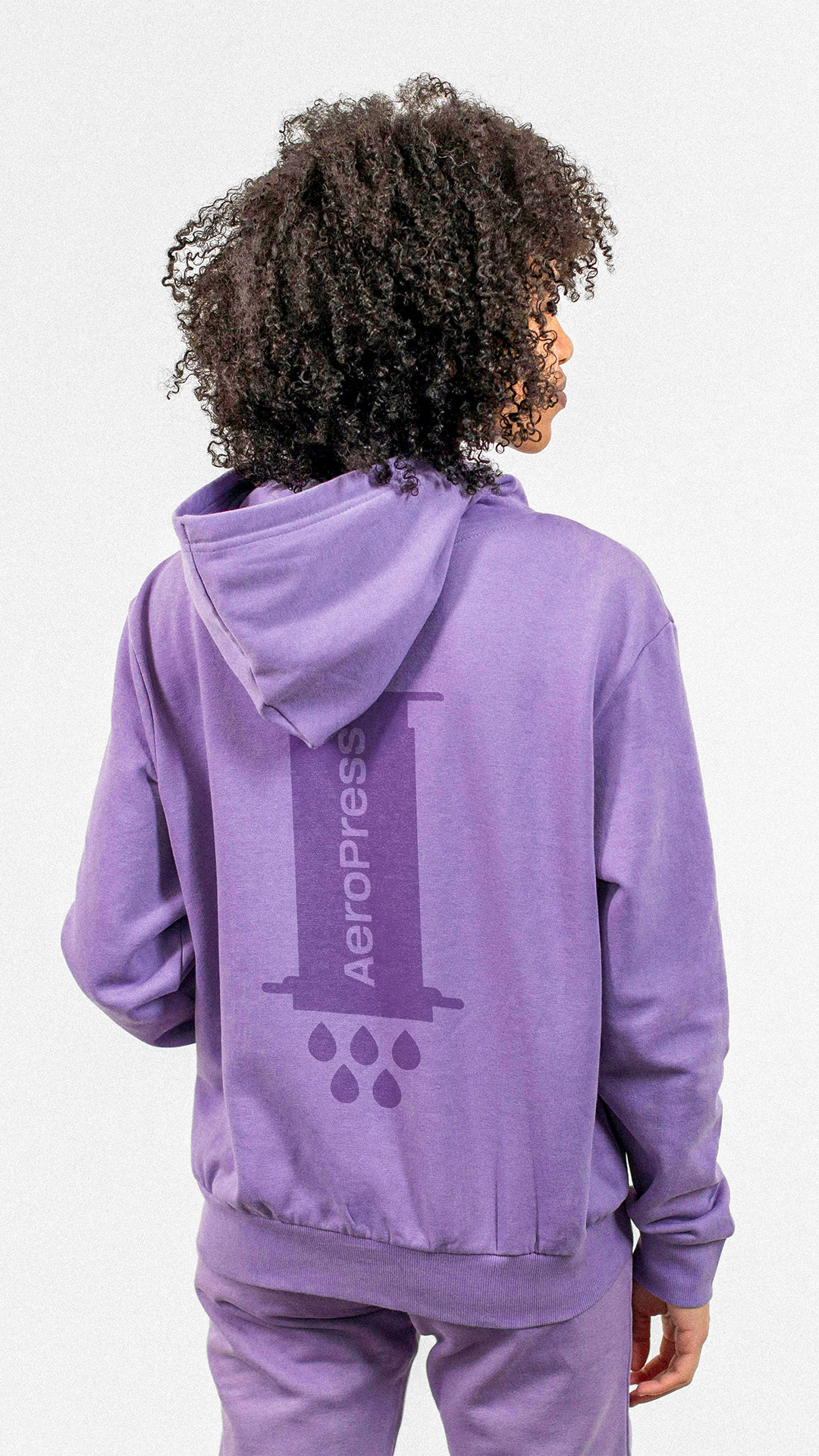
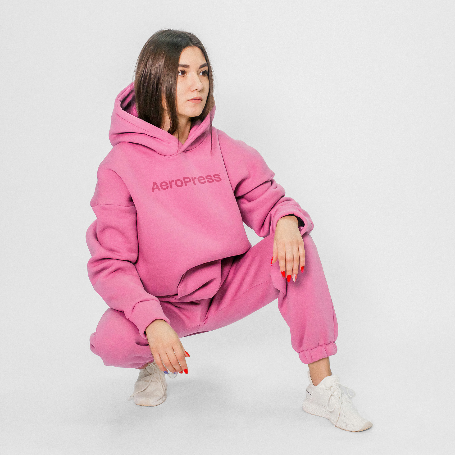
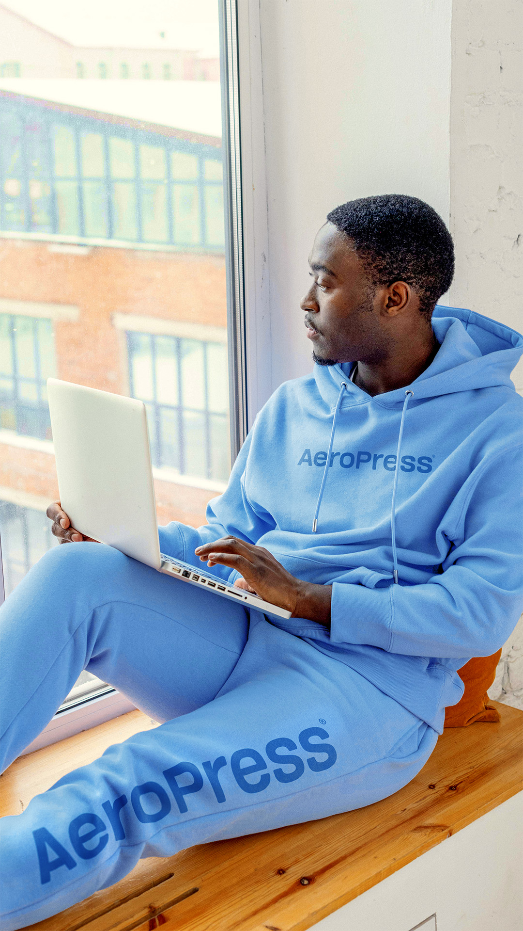
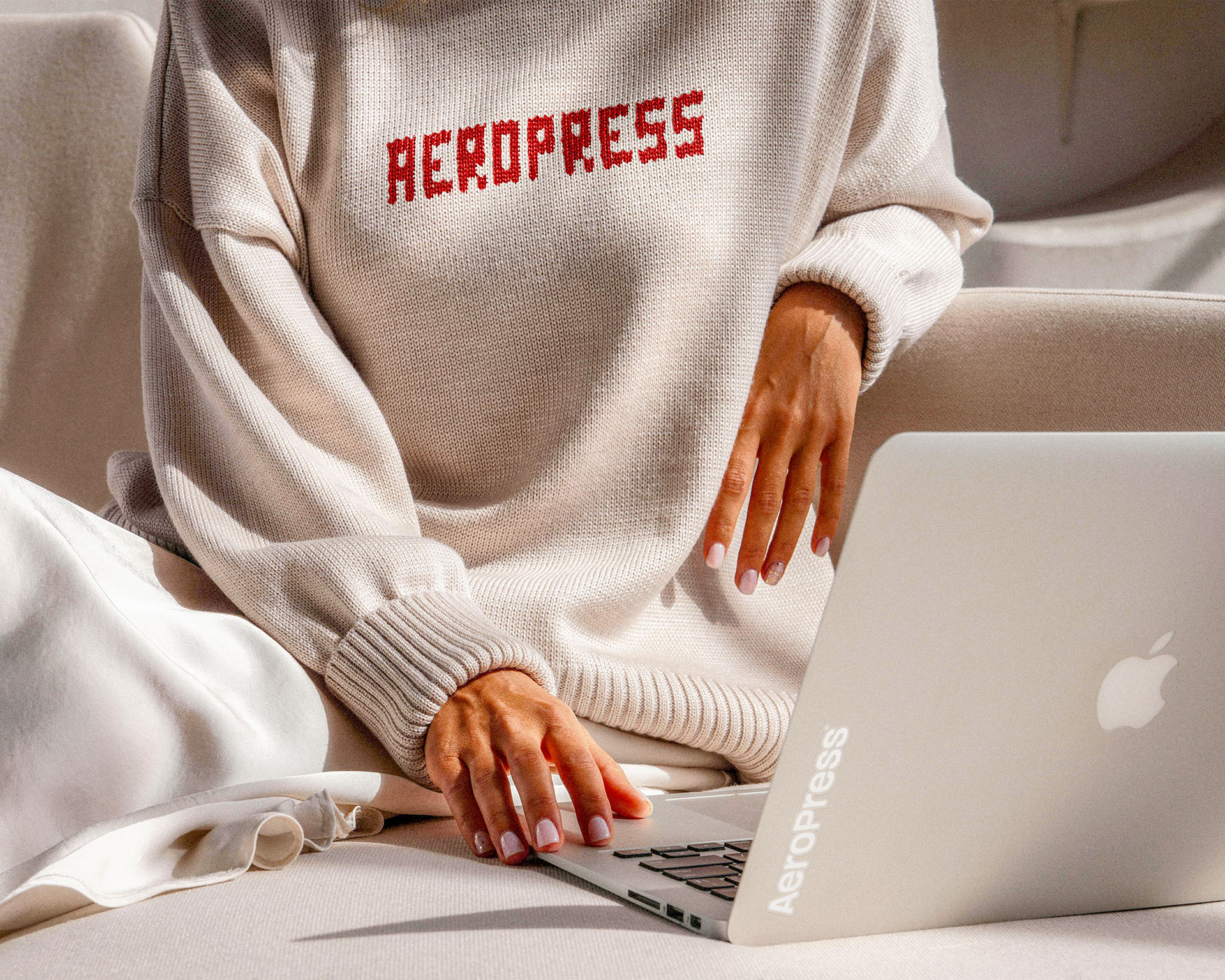
Imagine AeroPress decided to collaborate with a company to create a line of relaxing loungewear / pajamas, that pair perfectly with waking up and making the best coffee possible. Taking an alternative view to having a cup of coffee, instead of the on the go, running out the door, on your way to work, we see the best side of having a fresh, warm, start to the day.
