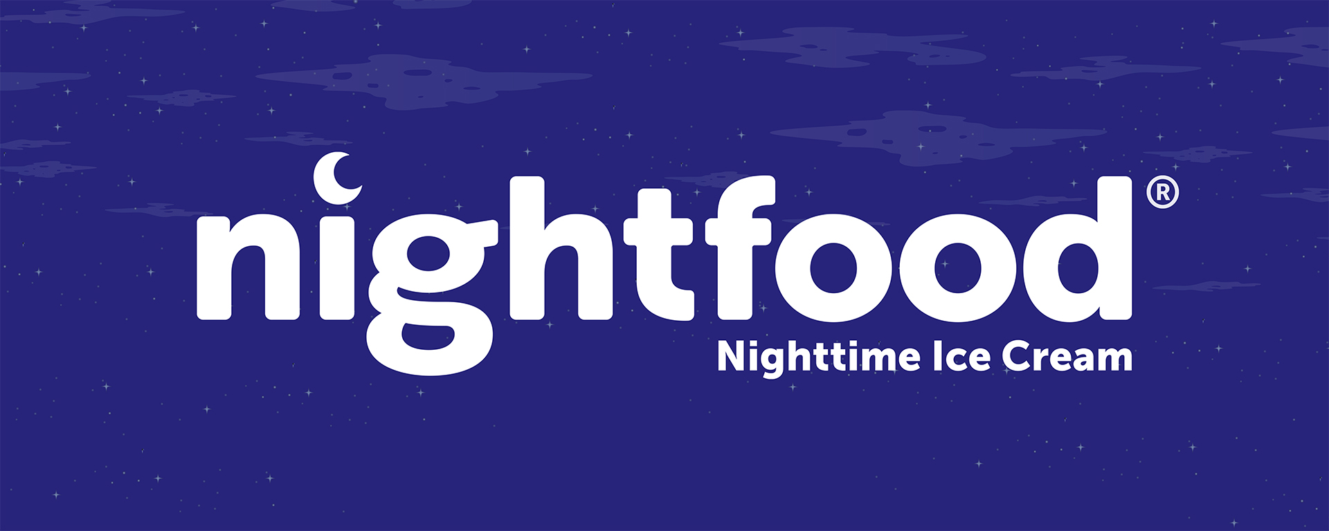
Nightfood
Offwhite Co:
Michael DelPup
Mackenzie Carey
Lindsay Spisak
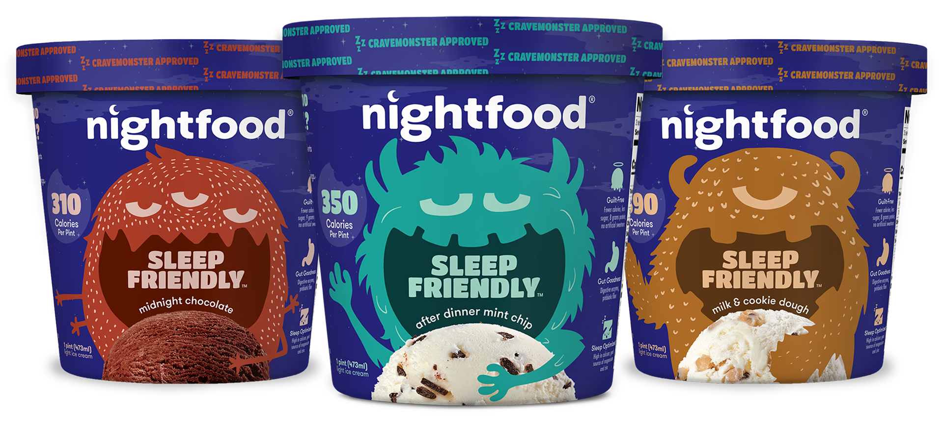
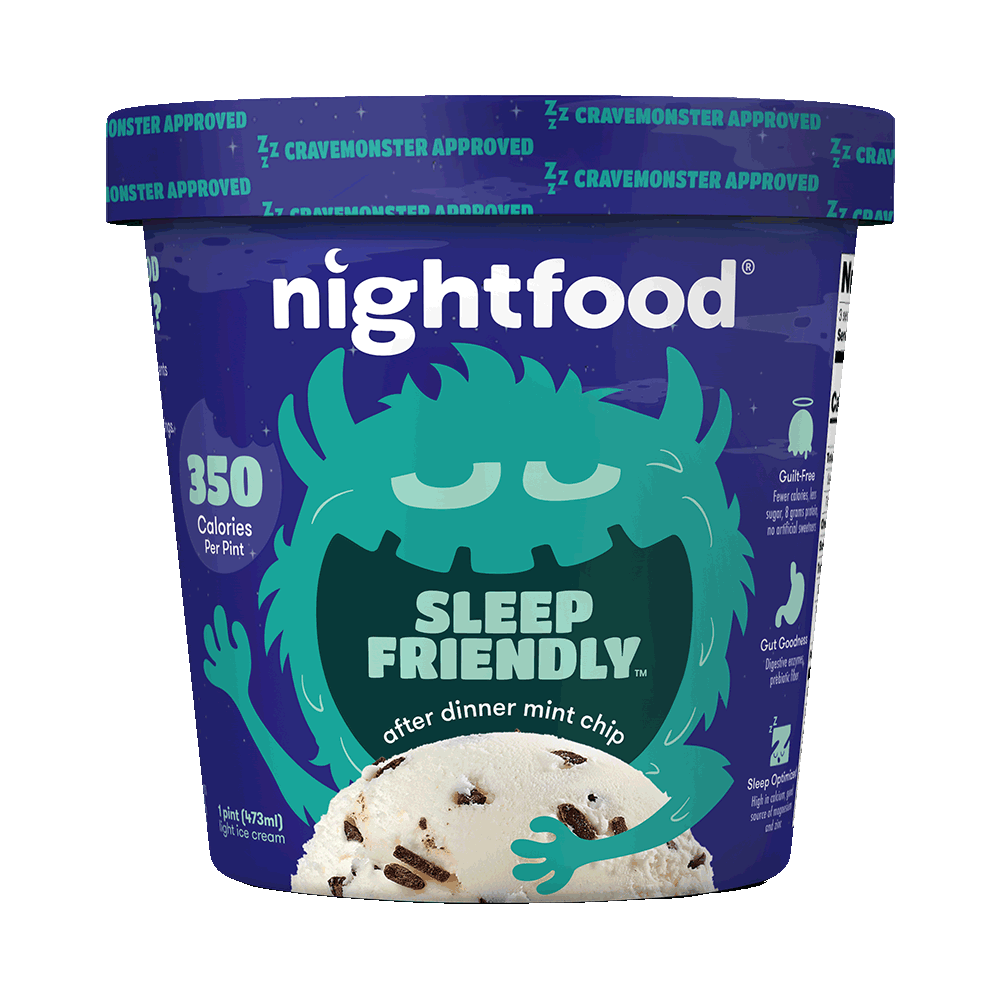
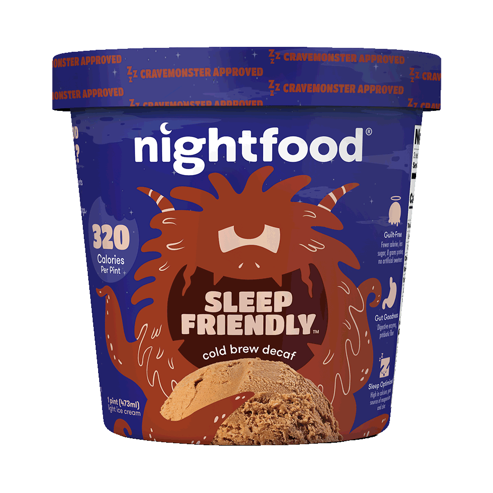
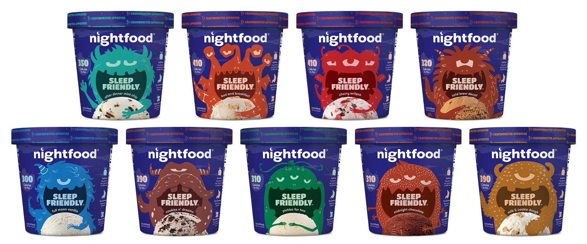
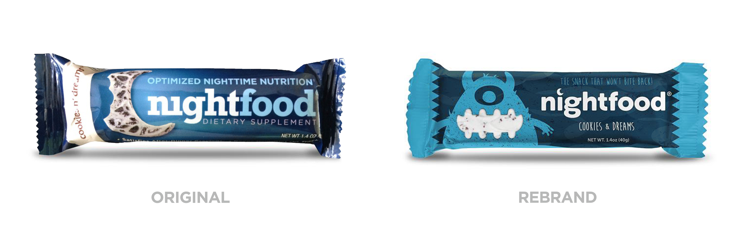
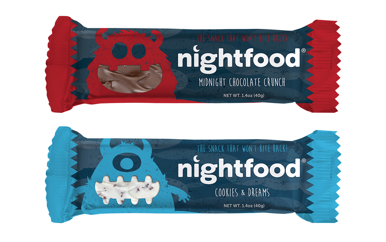
Nightfood approached our team, wanting to ditch their old, “protein bar” look in favor of something more playful and focused on appetite appeal. The distinctive characteristic that sets Nightfood apart from other bars on the market is that it satisfies those late-night cravings for sweets (hence the “Satisfy the Crave Monster!” concept) with relatively few calories and without keeping you awake. We decided on a fun character illustration, designed in-house, to pair with a photo of the ice cream itself and choosing an extensive color palette that matched the flavors.
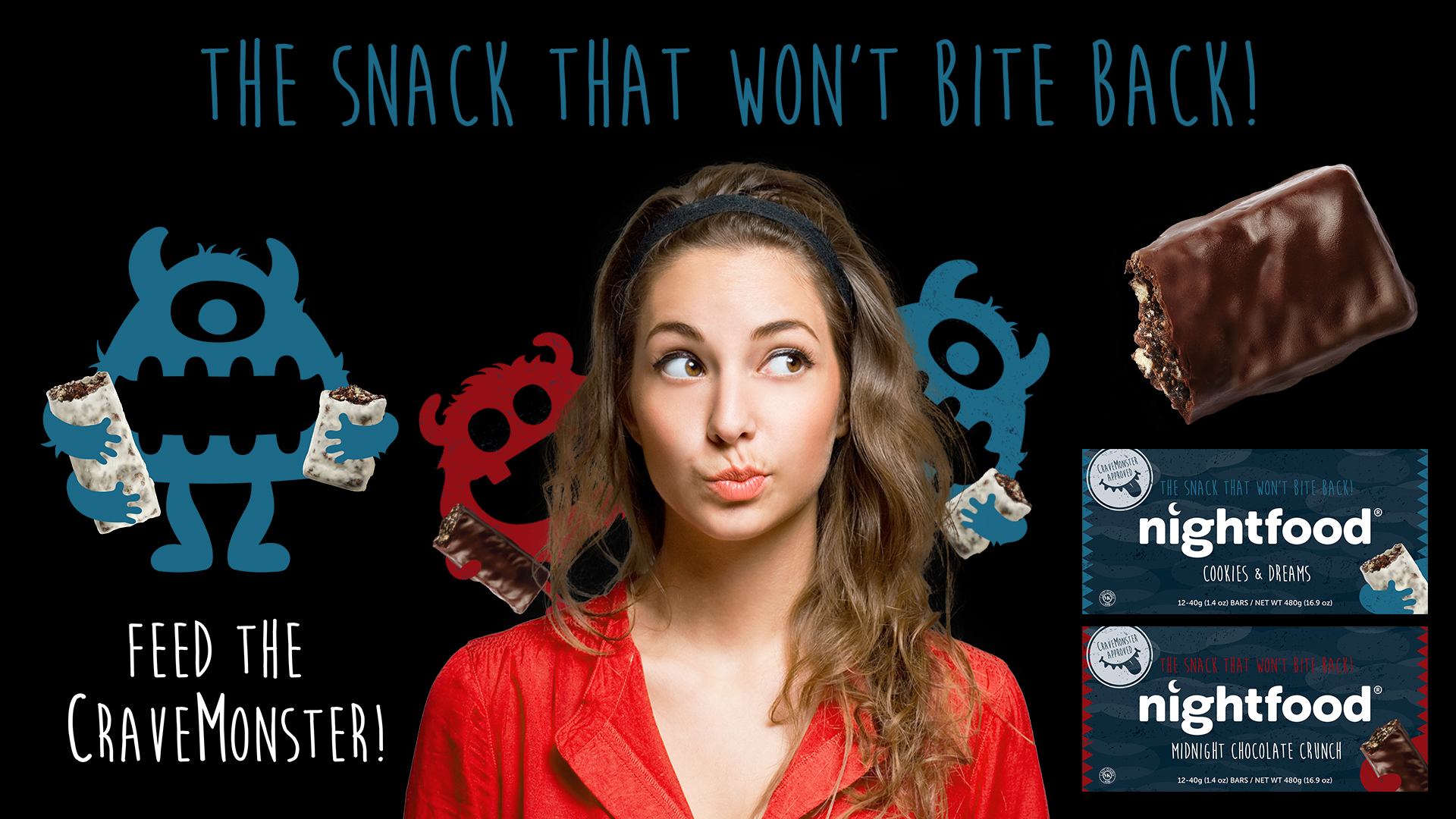
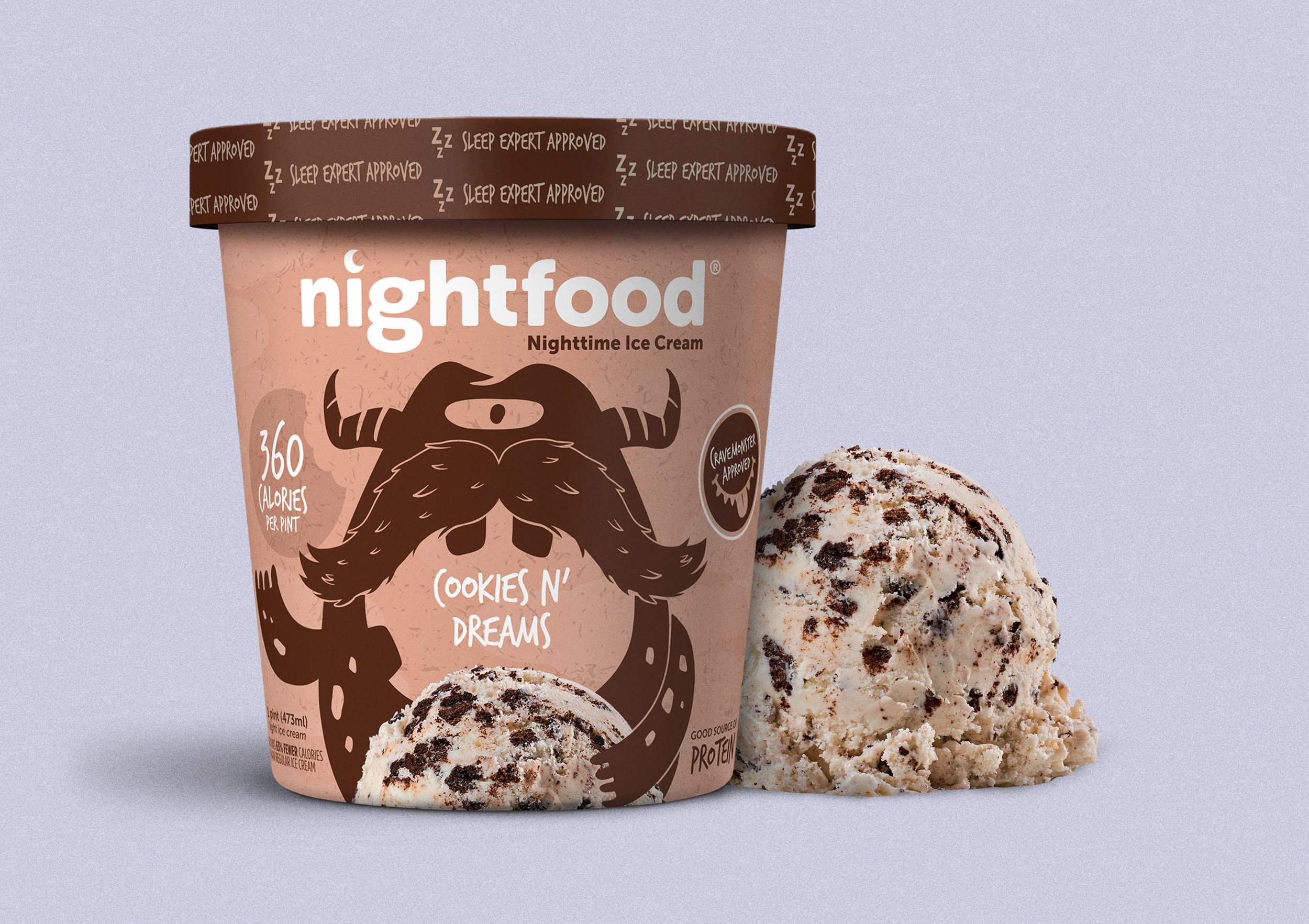
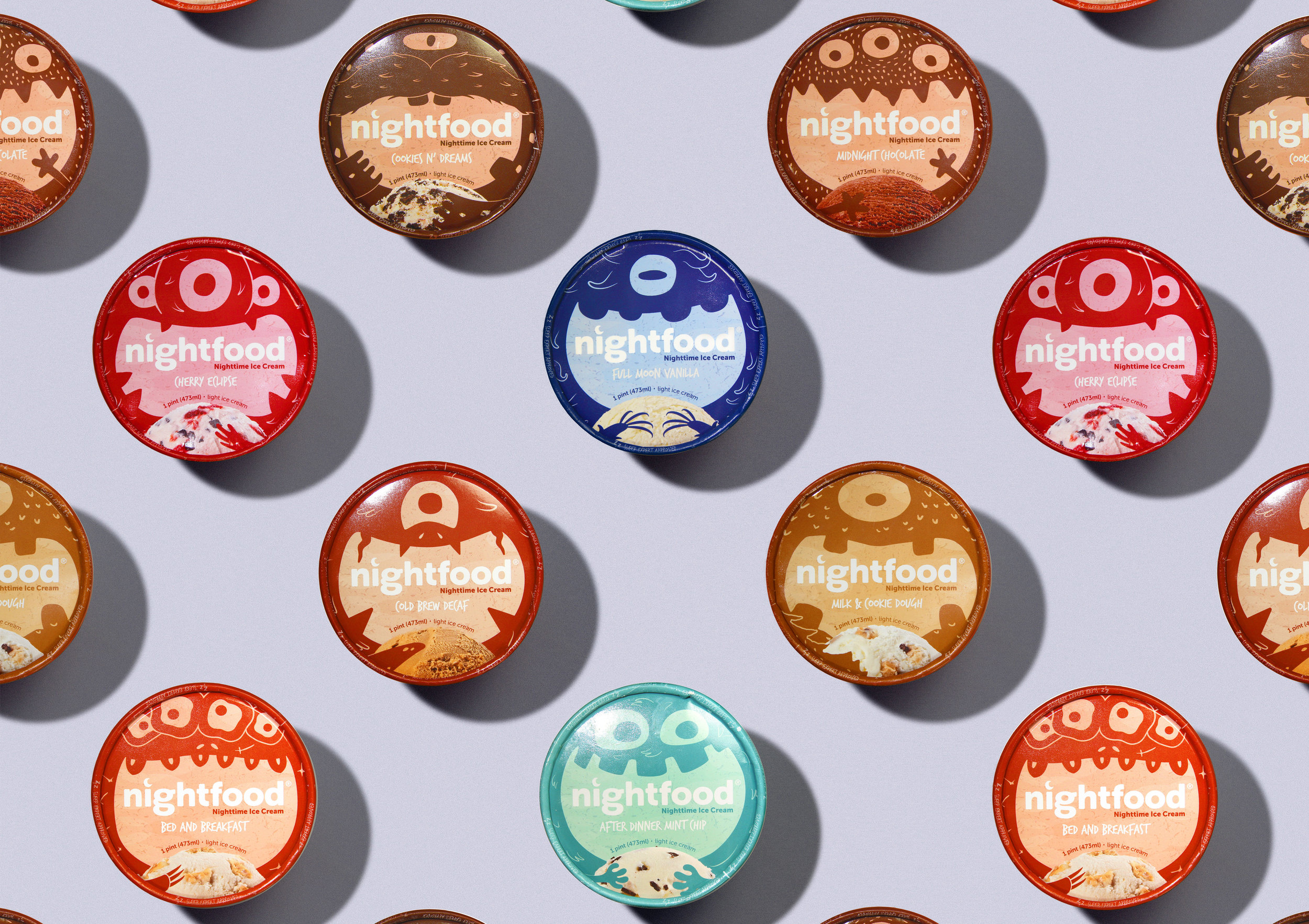

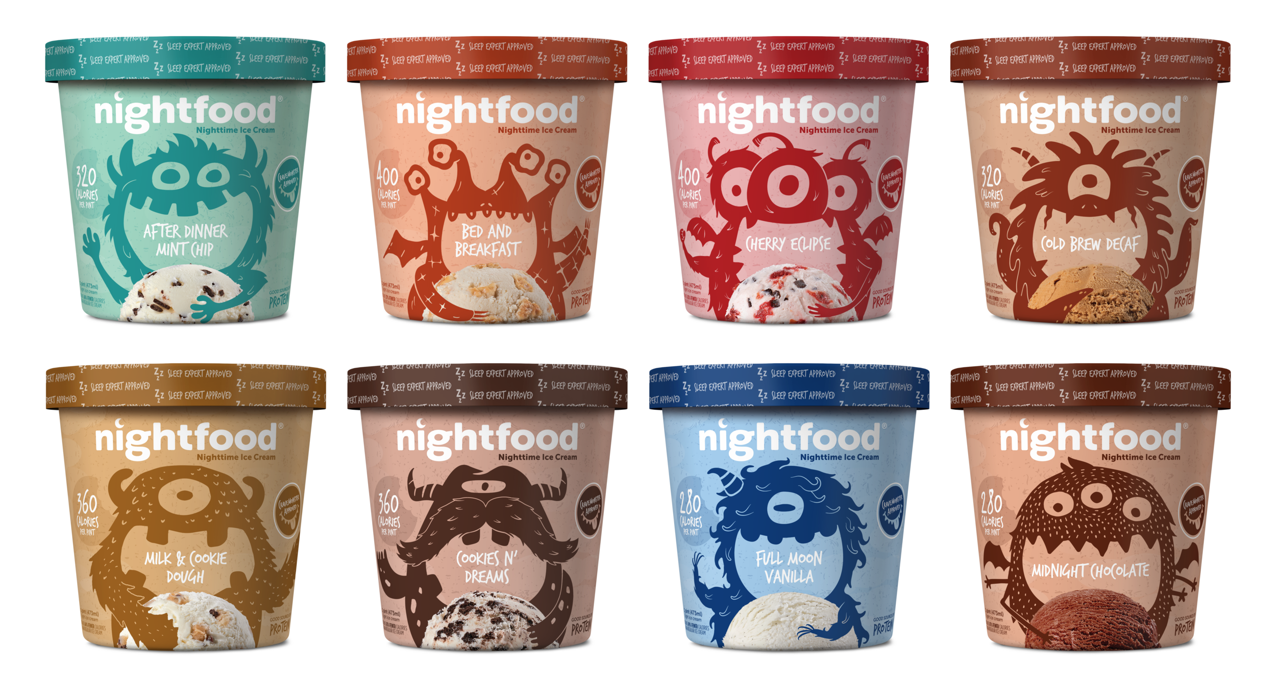
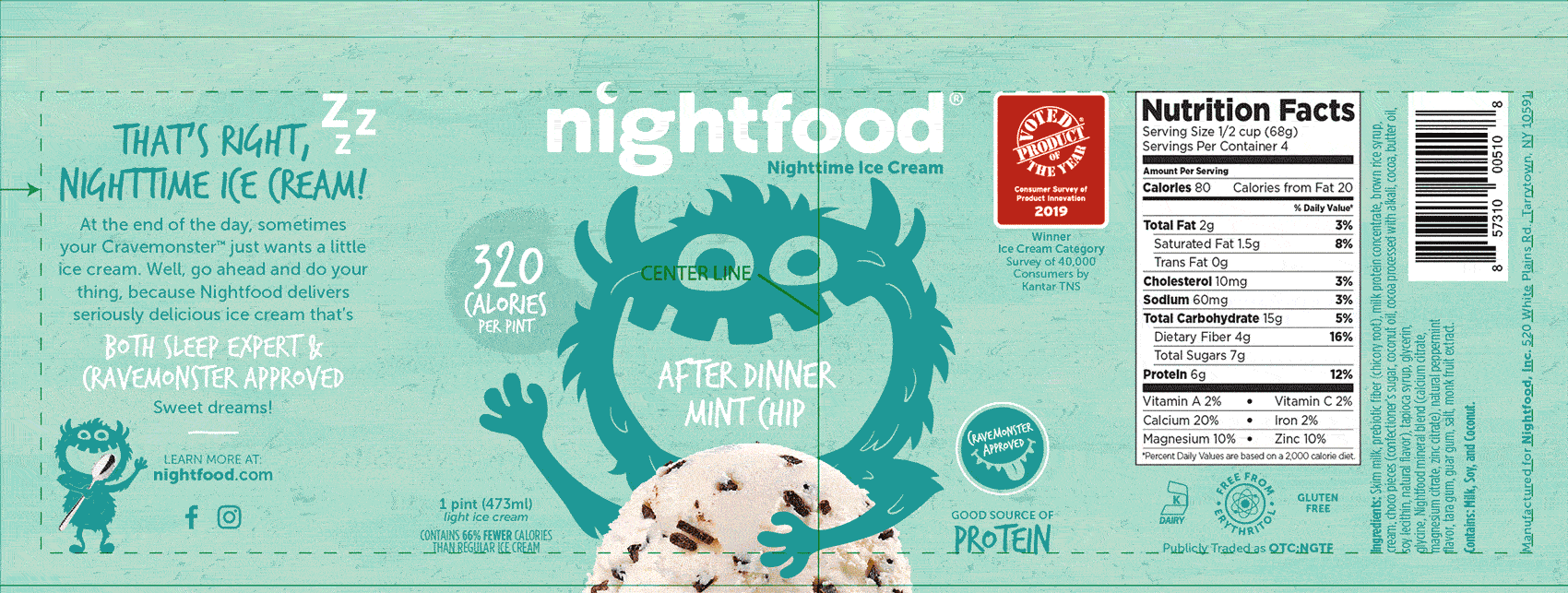
After the initial rollout for a few years Nightfood came back to us with some design updates to help unify the system across all of the packaging. While keeping the monsters was a necessity, we updated the characteristics and amplified the messaging of a nighttime ice cream to help sleep, by changing their expressions and calling out Sleep Friendly™. With new information, ingredients, and finalized callouts, we updated the type families, added new icons for better comprehension, and focused on all of the new benefits for the back panel.