Julia Jayne Pilates
Offwhite Co
Michael DelPup
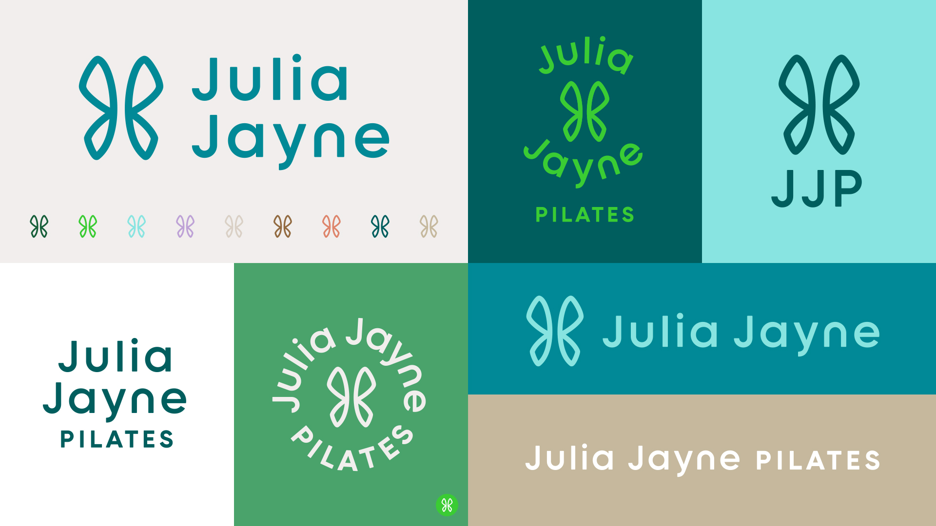
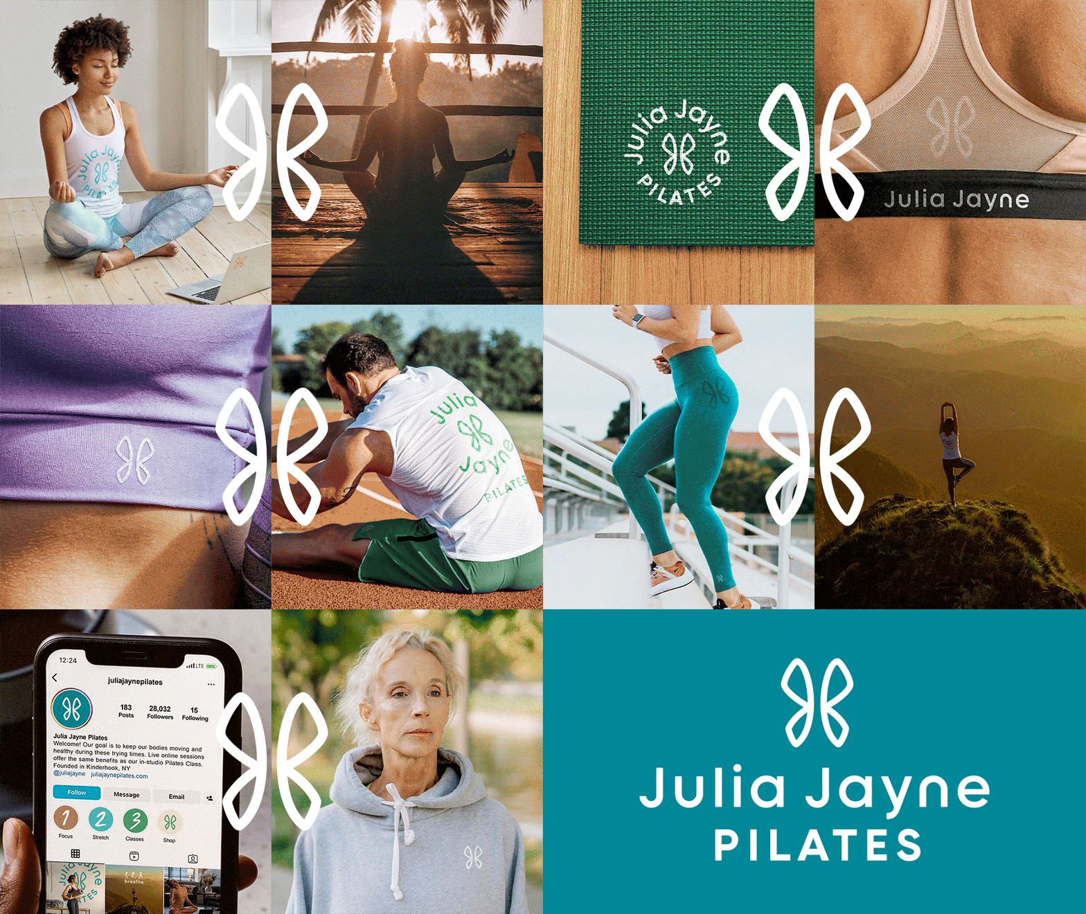
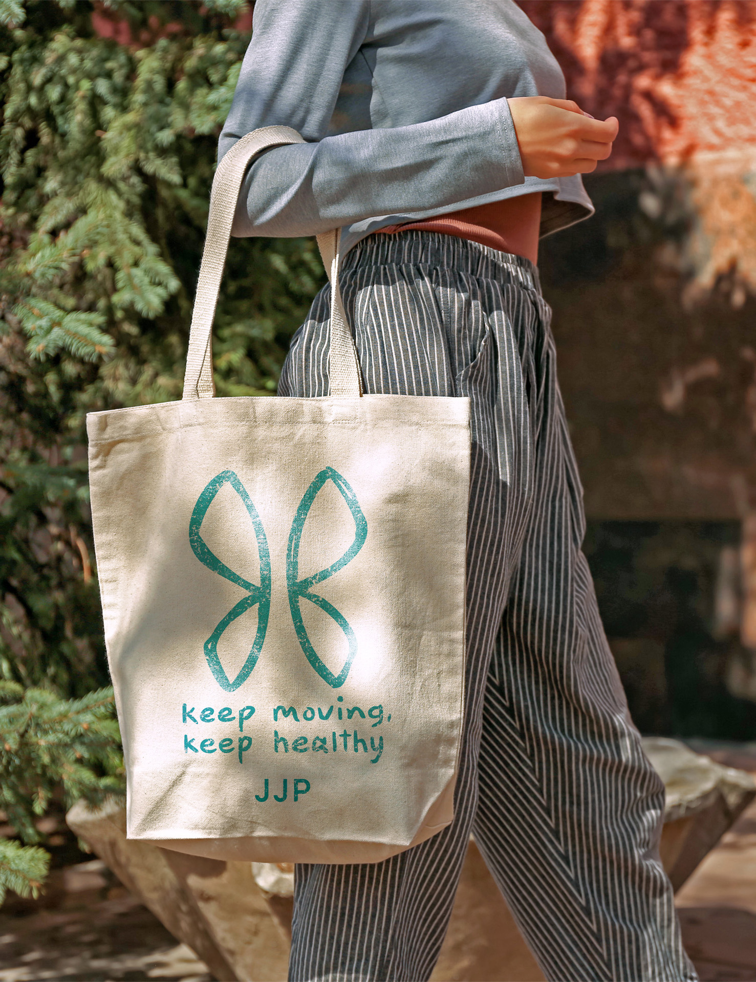
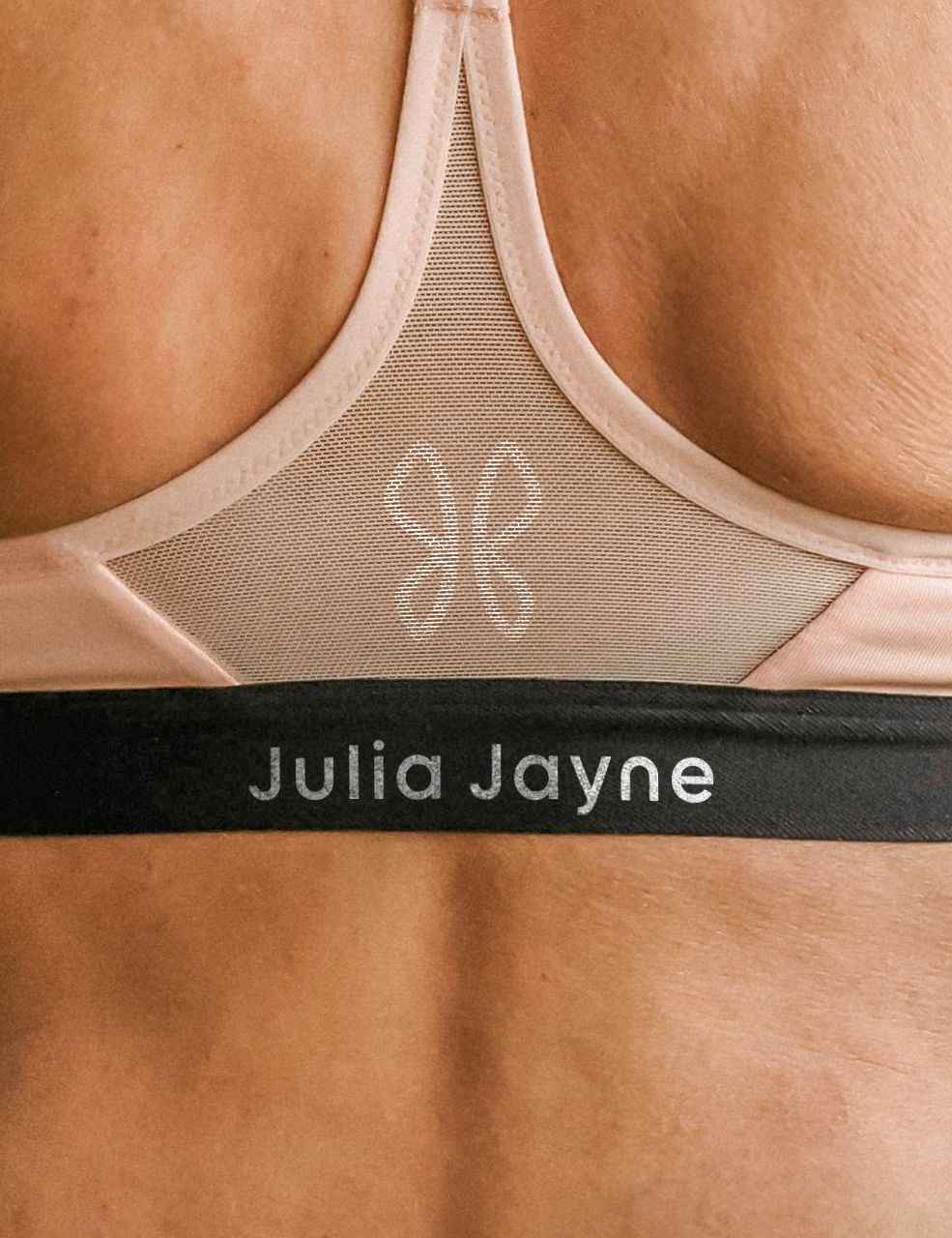
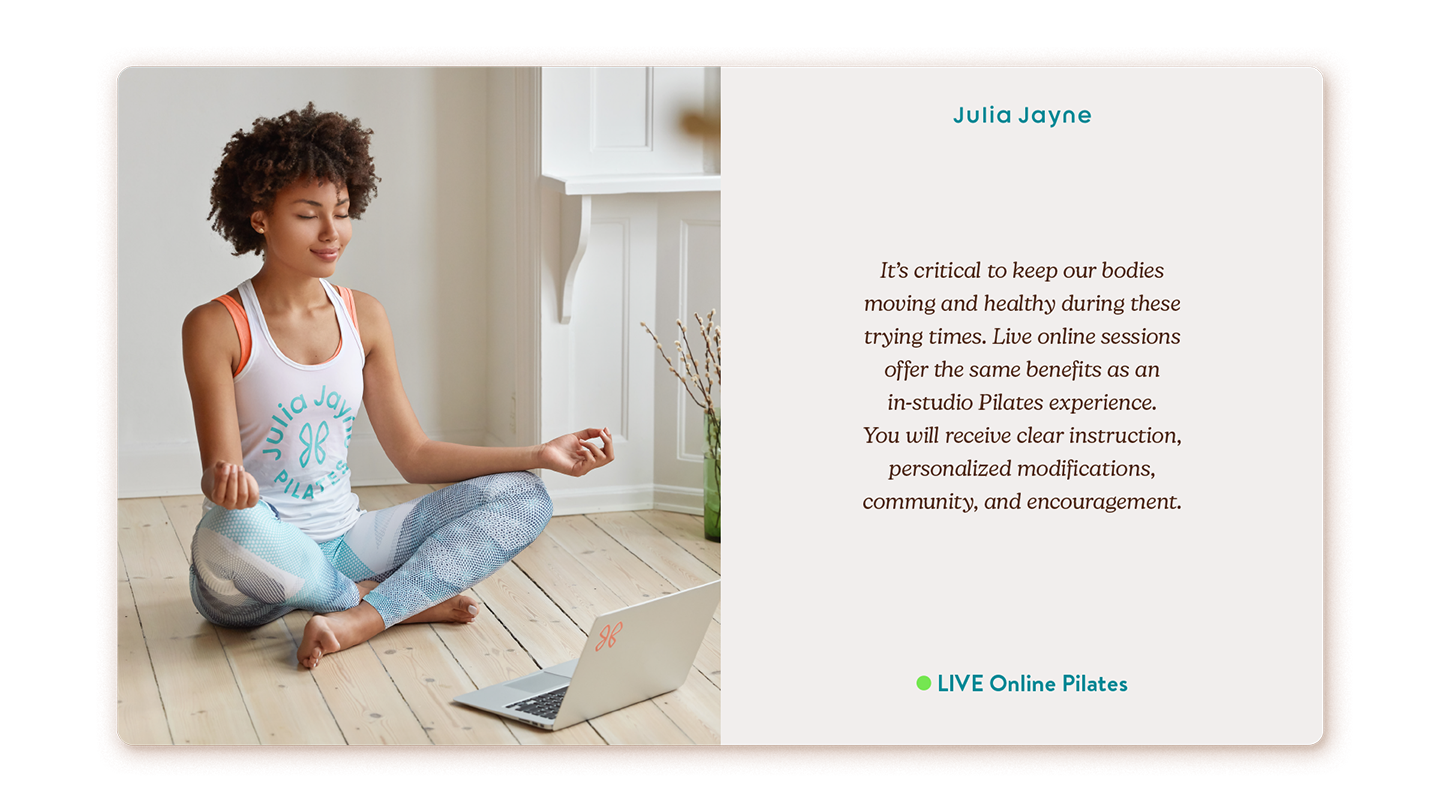
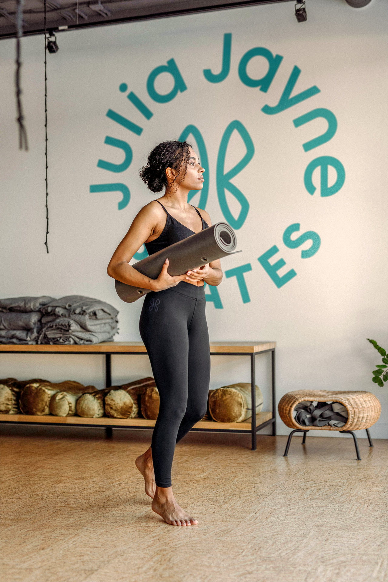
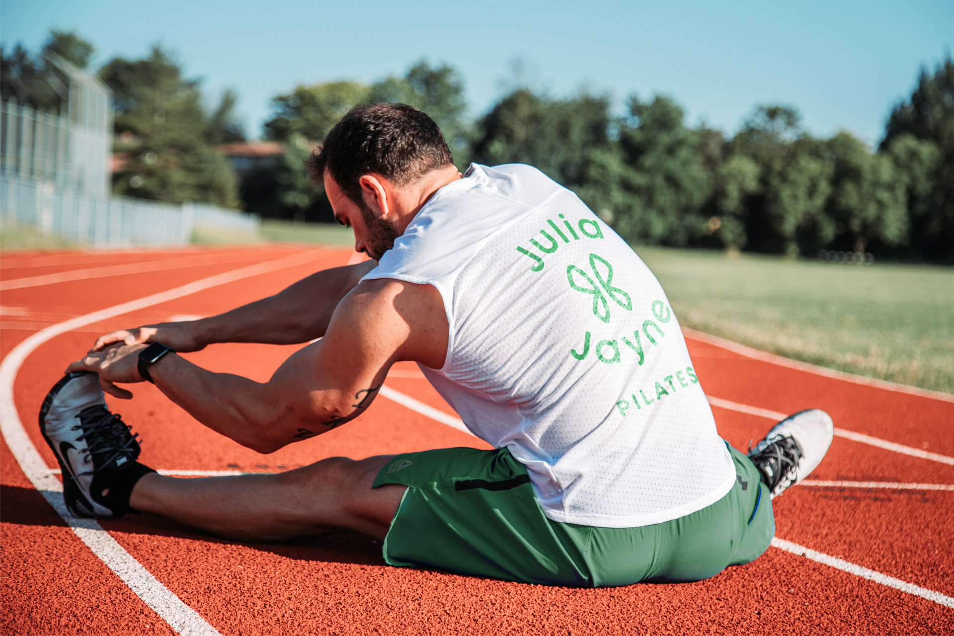
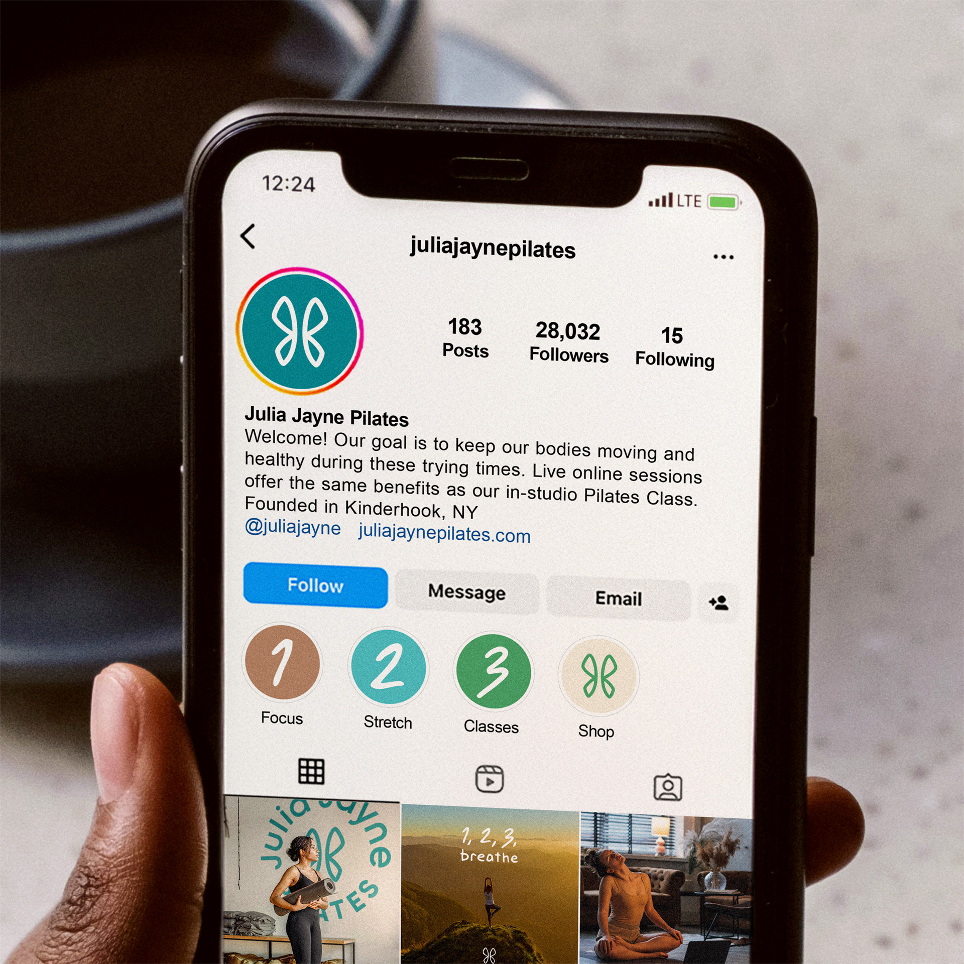
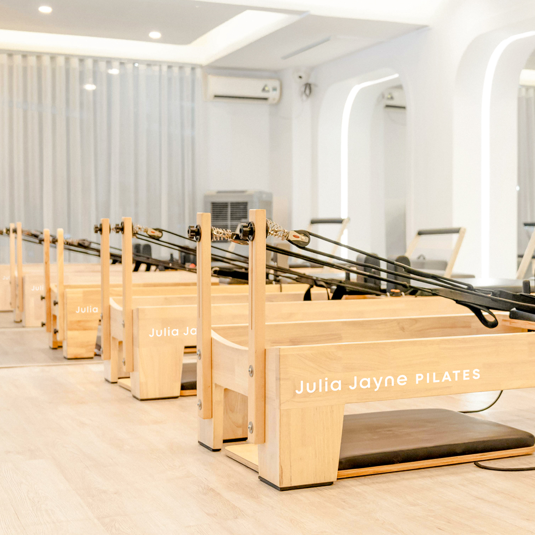
Julia has been a long time friend and past client of the studio through our work with Maple Hill. She asked if we could update her current brand for her pilates company. Right before the pandemic started I was able to finish the initial brand system for her as she was offering online classes. I have updated and added to the brand system since that time. Turning the earlier logo design into more of a lifestyle athletic wear/pilates brand.
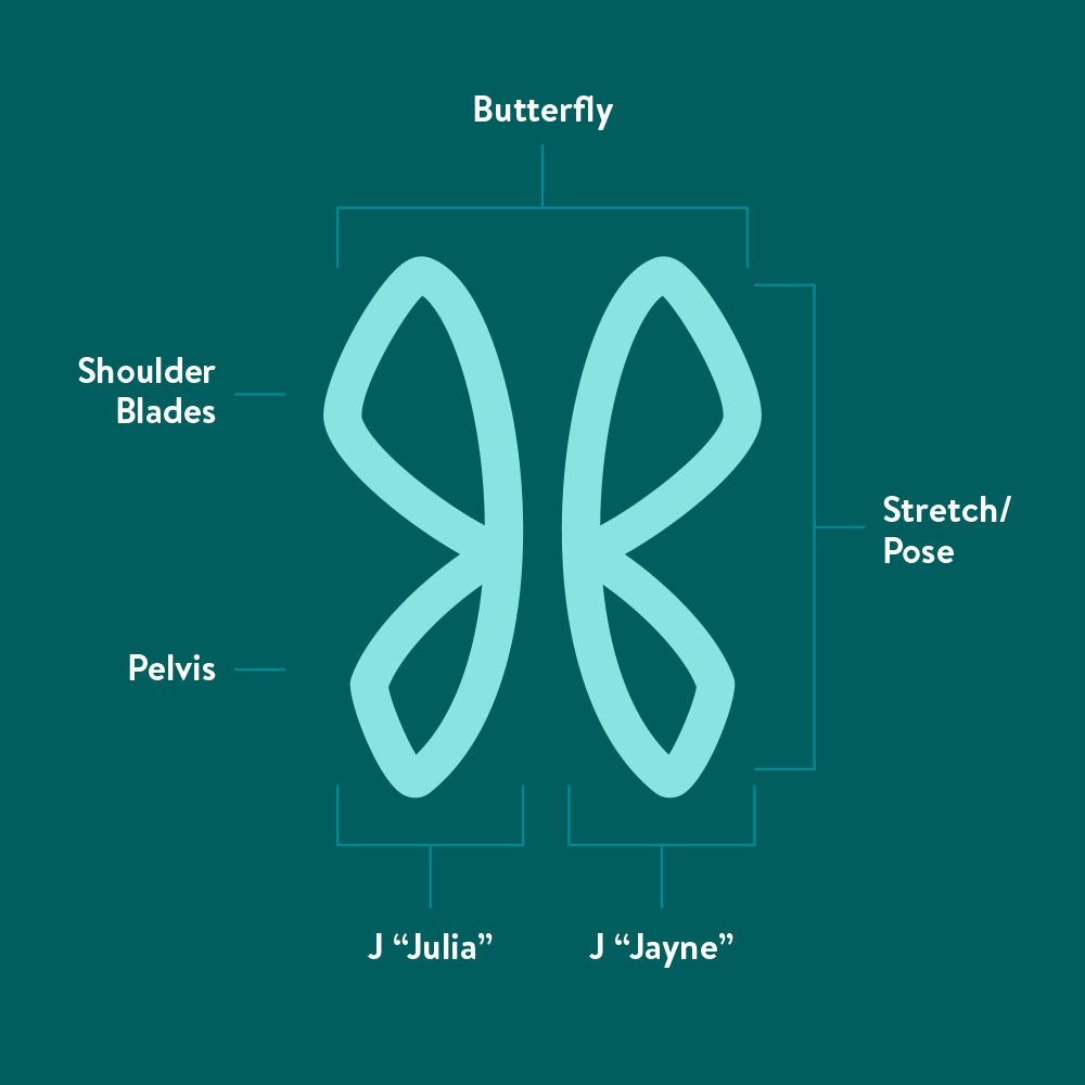
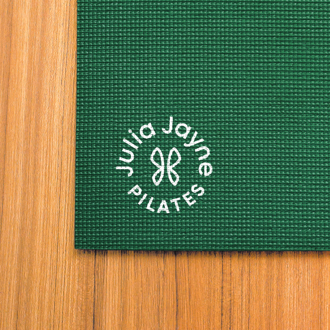
During the initial research and exploration stage our goal was to create a logomark that was easily recognizable by itself, had multiple representations involving pilates, and was unique enough for a brand that isn’t just for physical health.
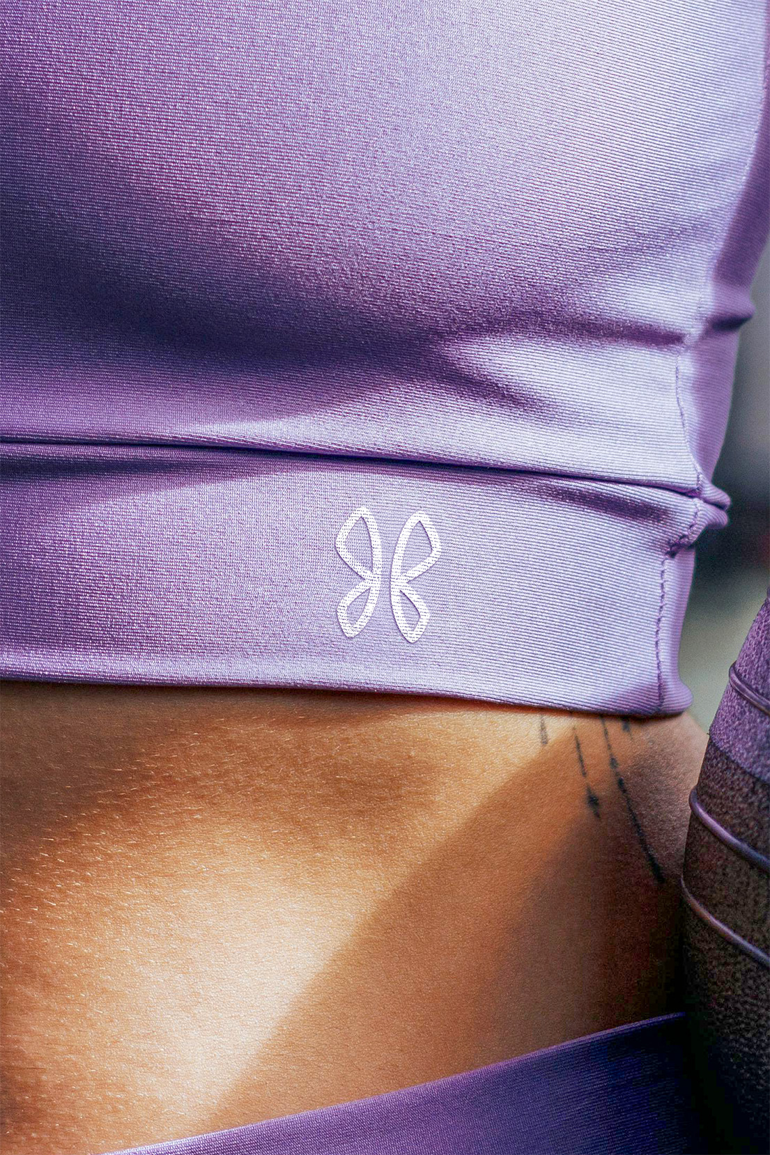
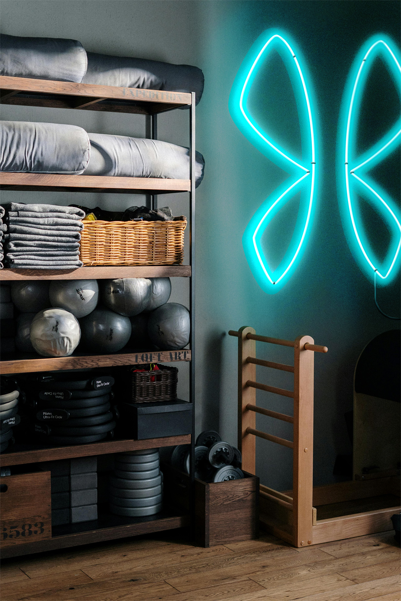
We ended up incorporating a hidden monogram into the mark because Julia is one of a kind with classes all her own. The two “J’s” from Julia Jayne’s name constructed as a script signature “J” with the second letter flipped. After doing so we noticed a butterfly emerge which symbolizes balance, hope, transformation, and freedom.
The core of the logomark portrays symmetrical body parts, from shoulder blades to the pelvis. With the pretzel like shape that is supposed to represent people folding and stretching, strengthening the subliminal messaging of a pilates exercise along with the butterfly pose.
