Maple Hill
Offwhite Co:
Michael DelPup
Mackenzie Carey
Ross Palumbo
Sabrena Khadija
Cow Photography:
Jean Schwarzwalder
Fruit Photography/Illustration:
Lori Anzalone
Photo Editing:
Michael DelPup
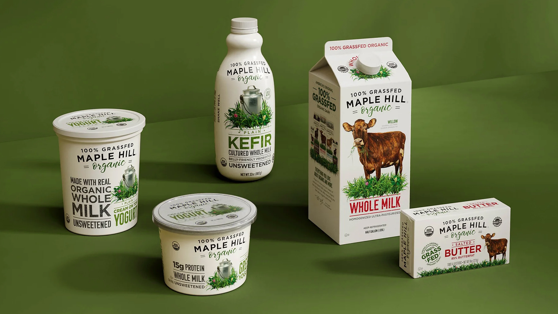
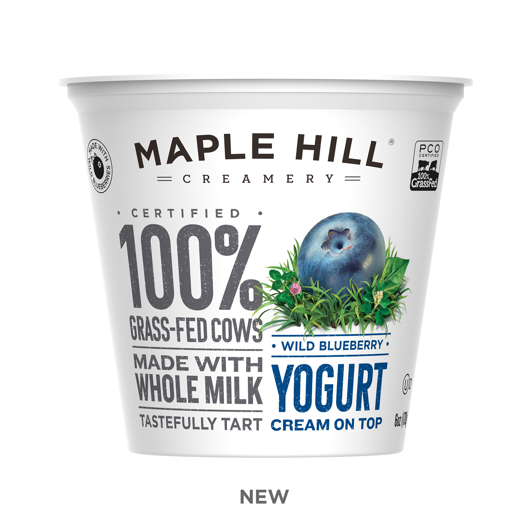
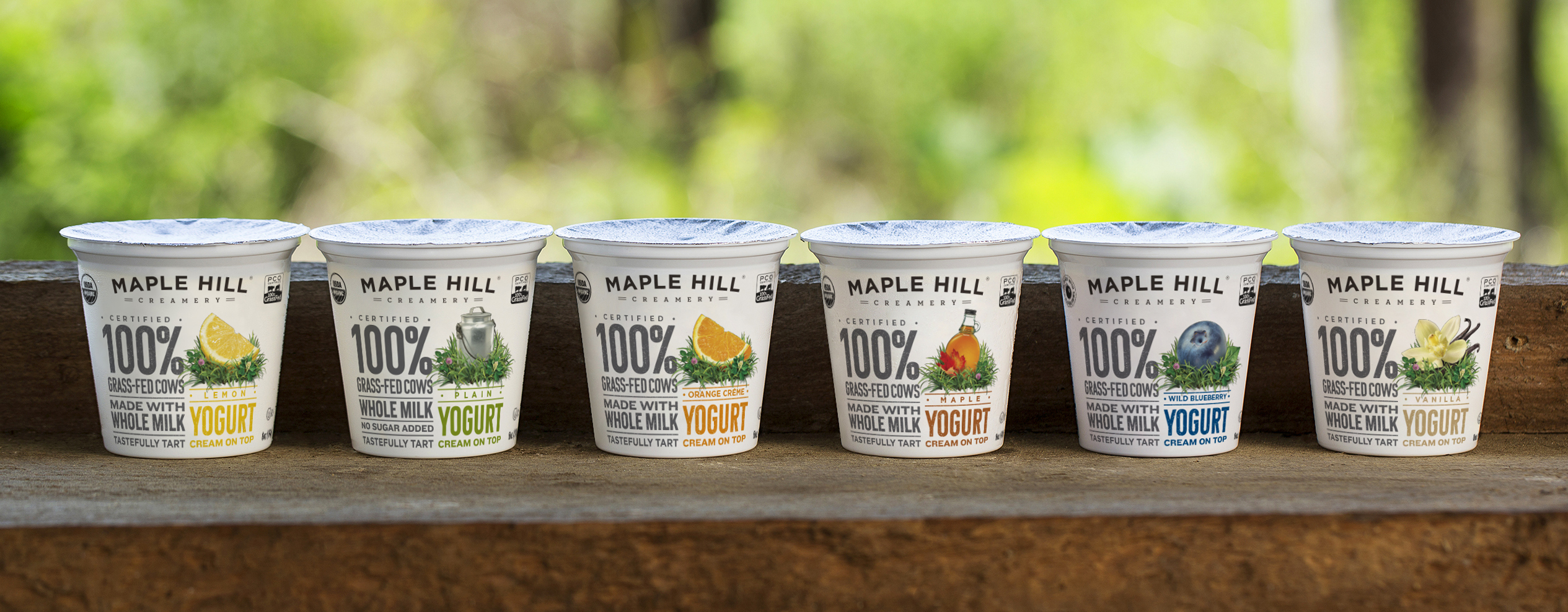
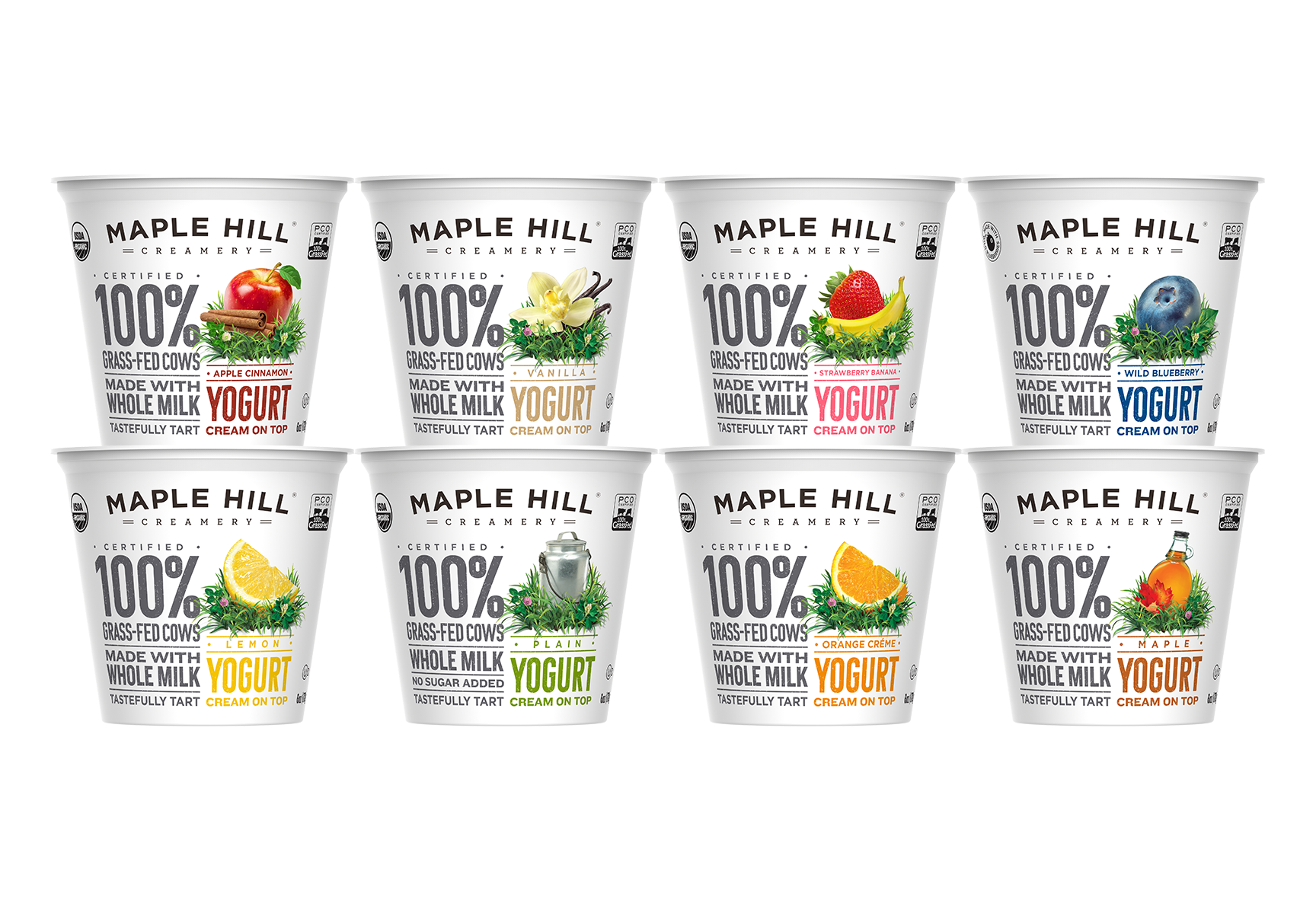
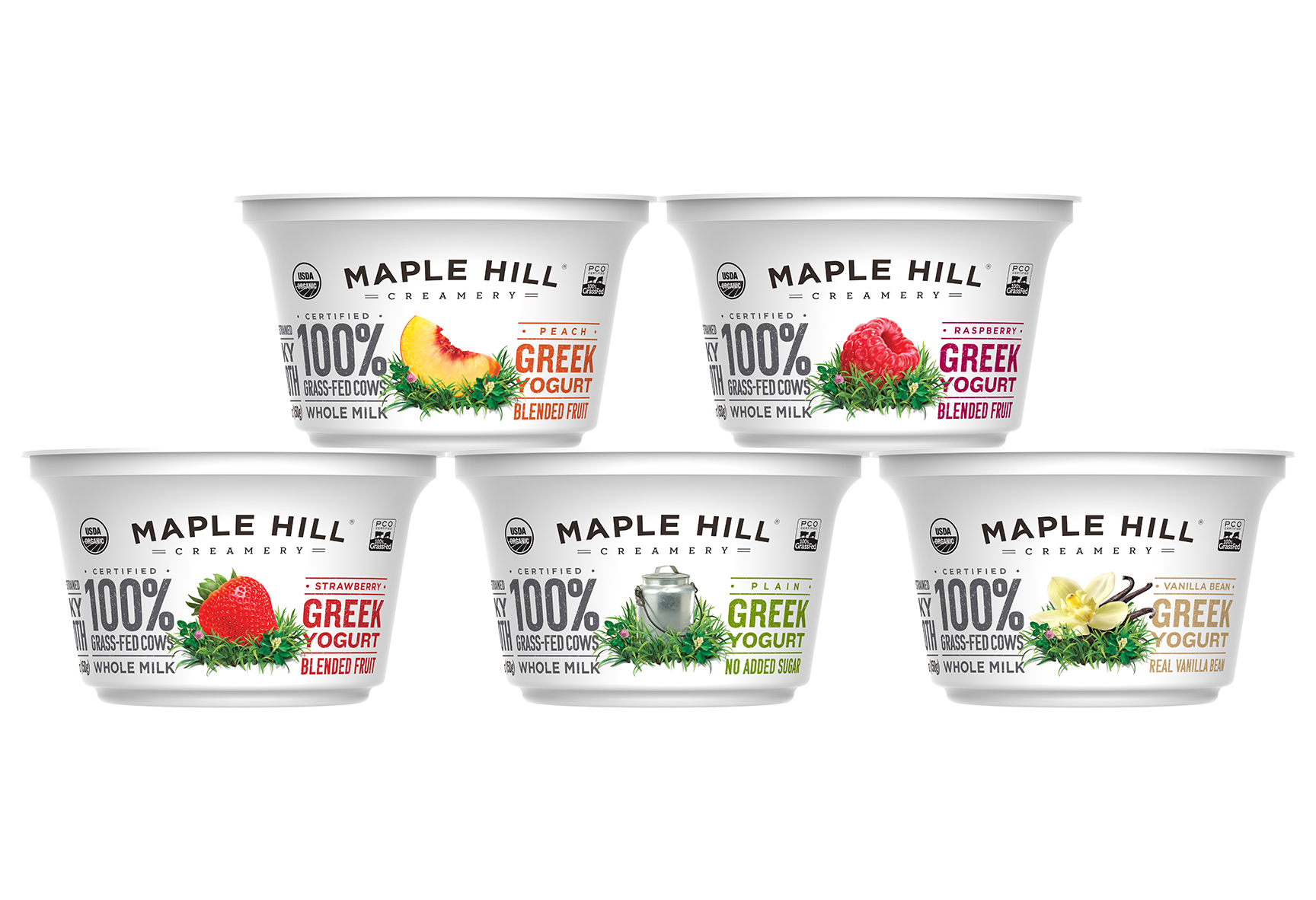
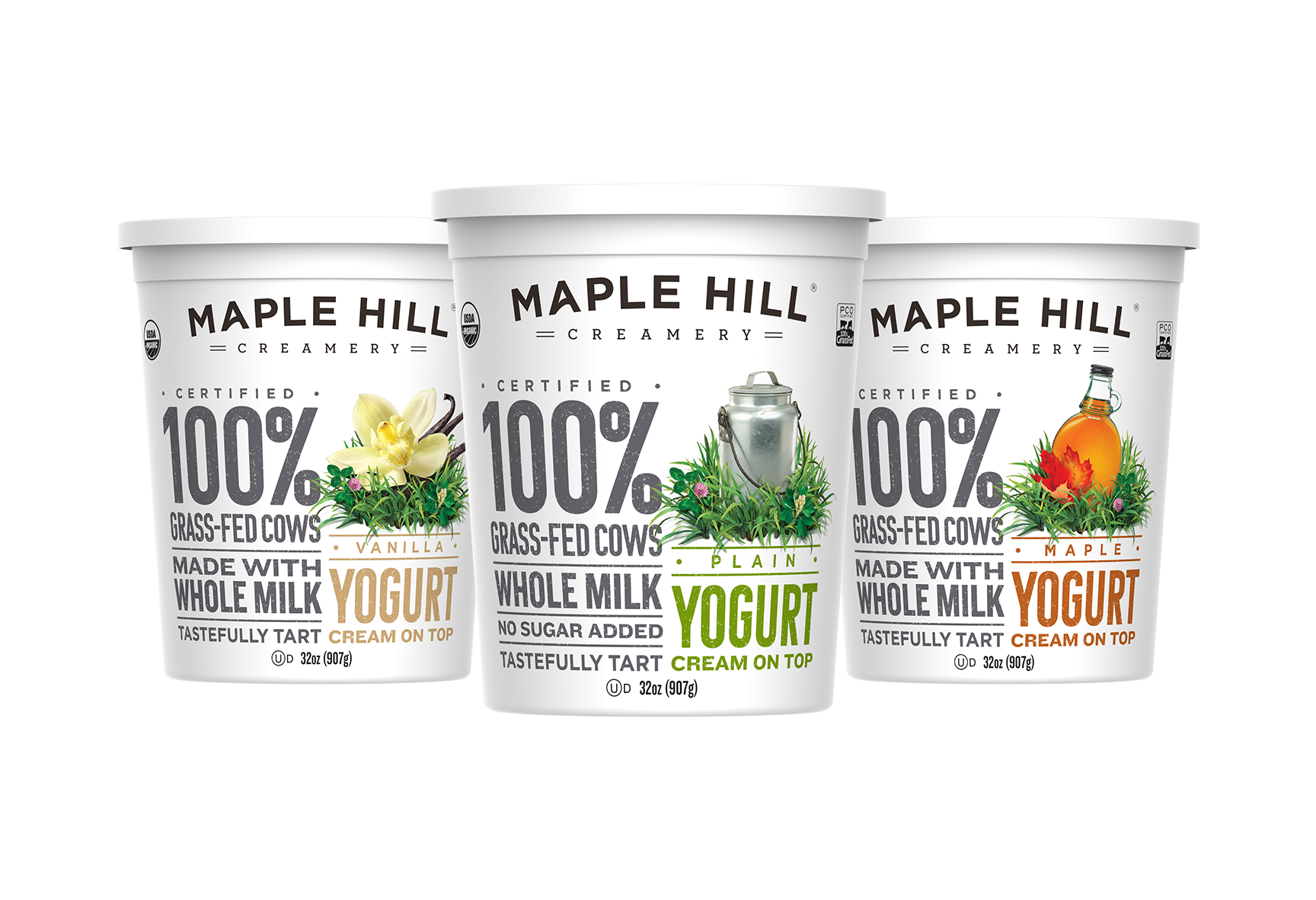
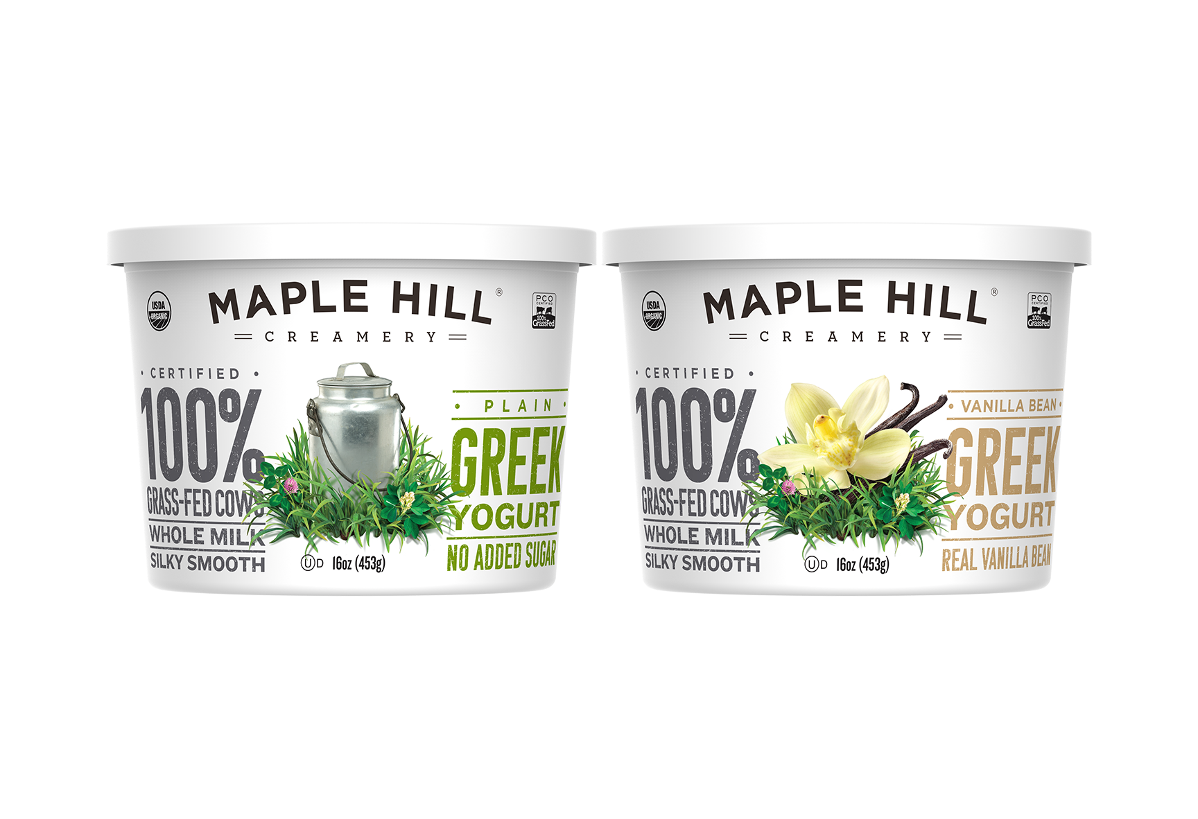
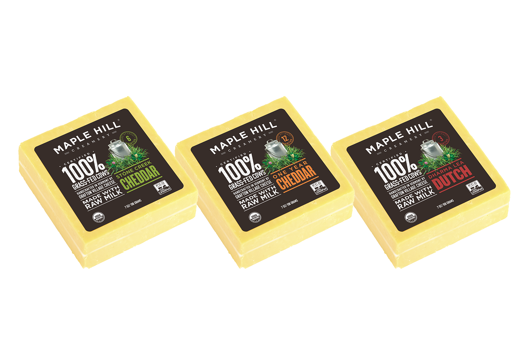
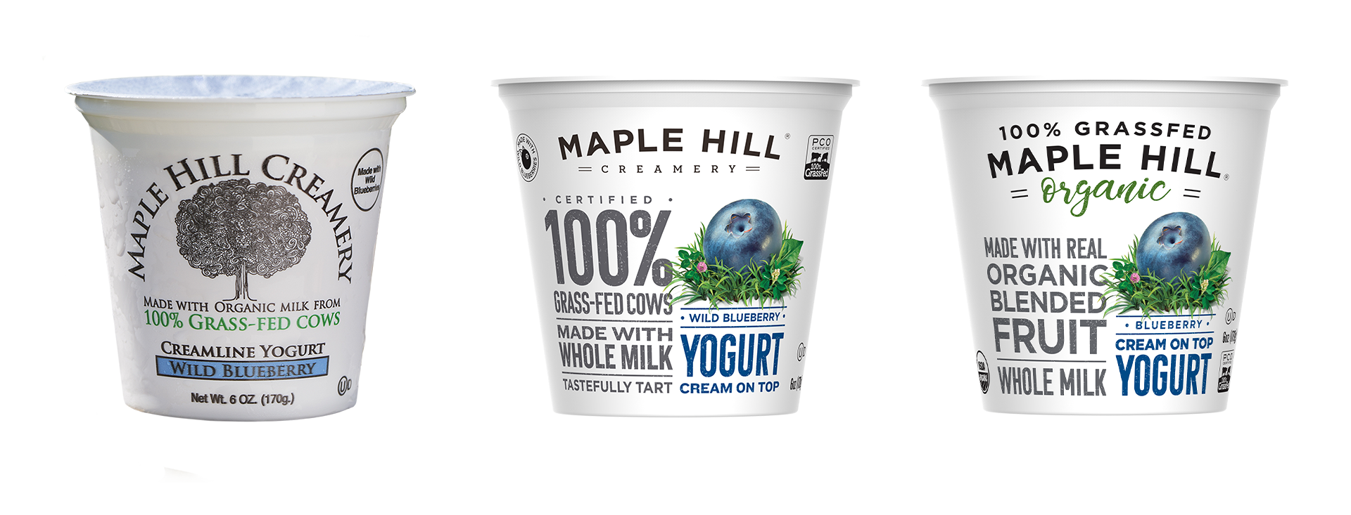
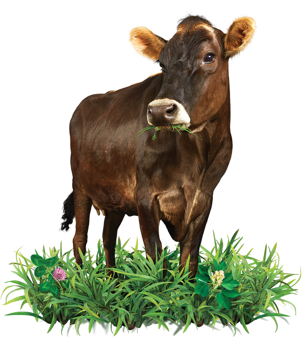
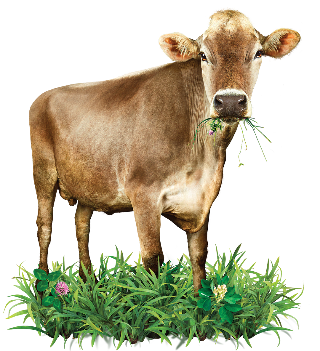
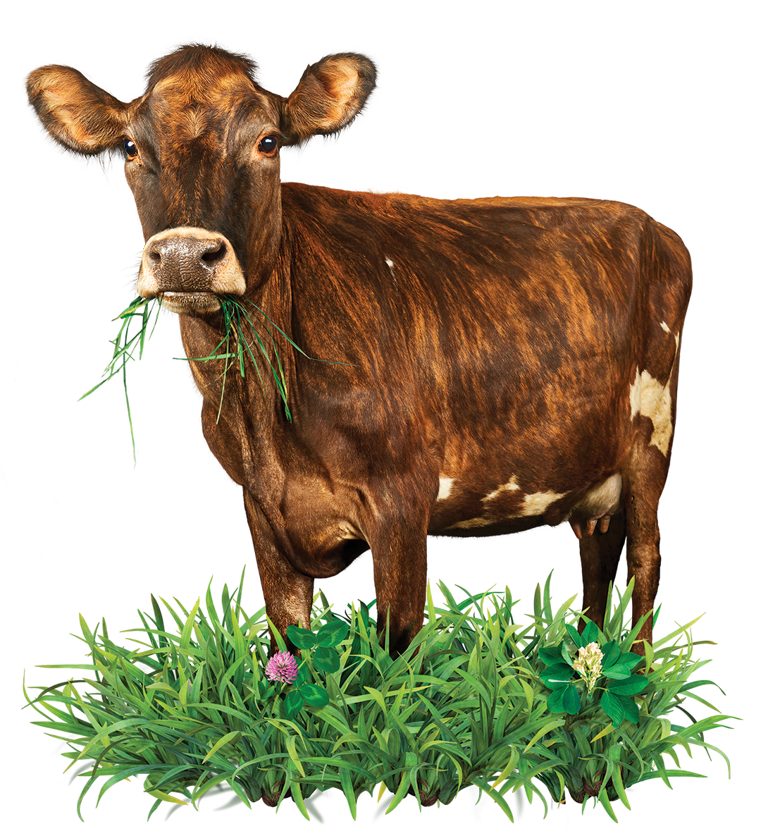
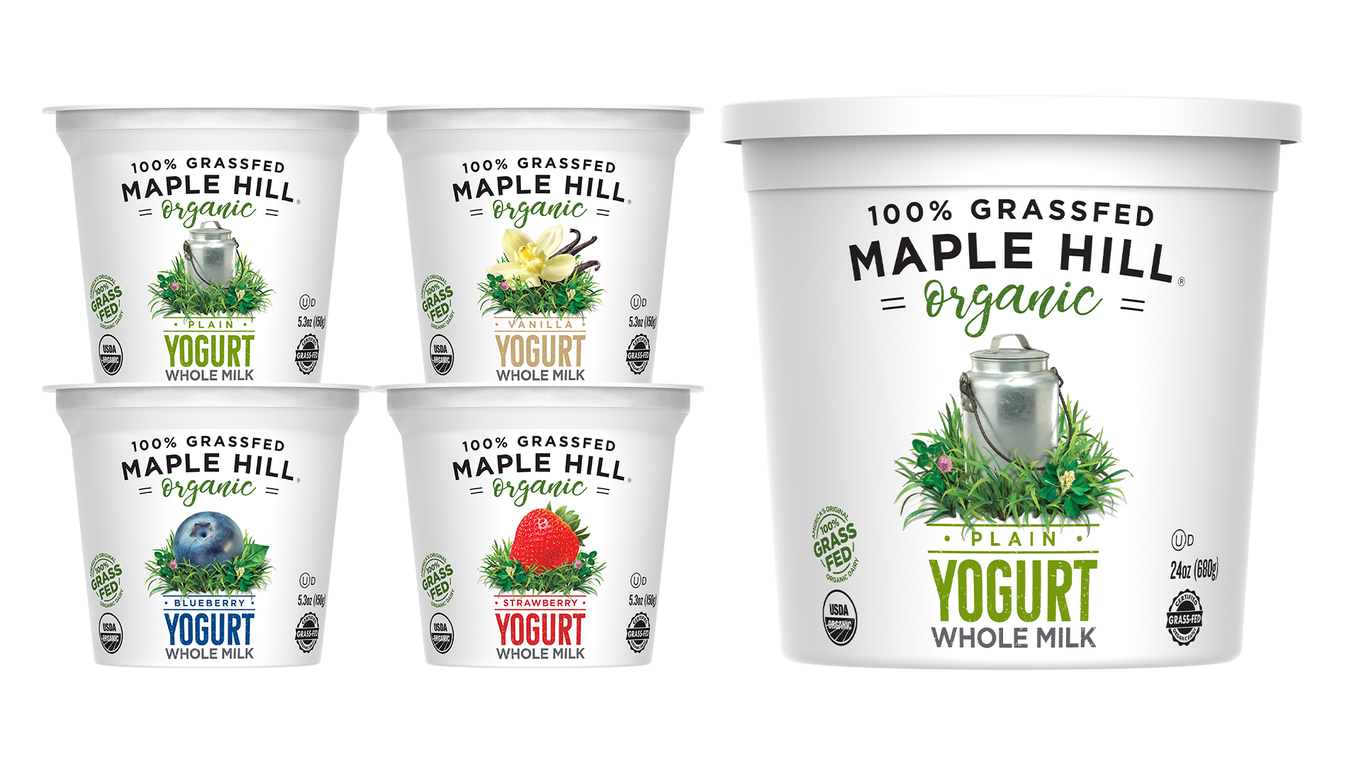
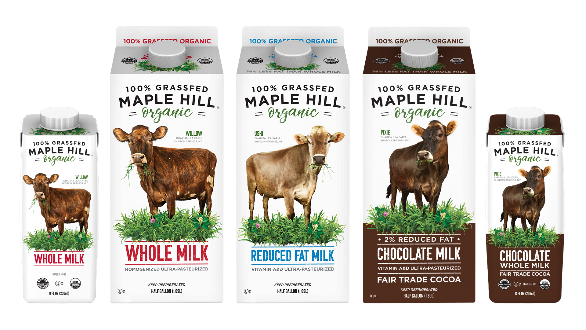
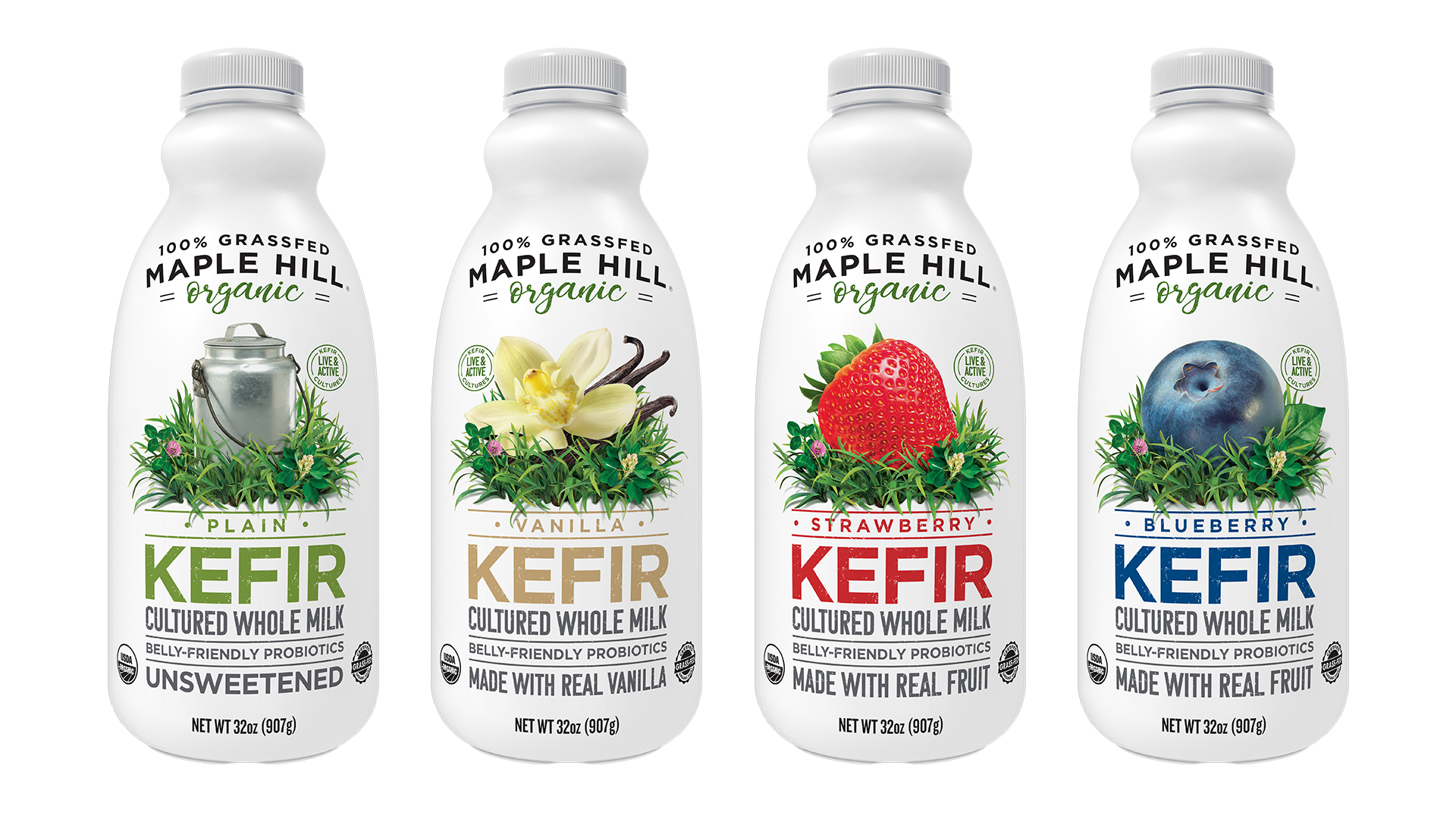
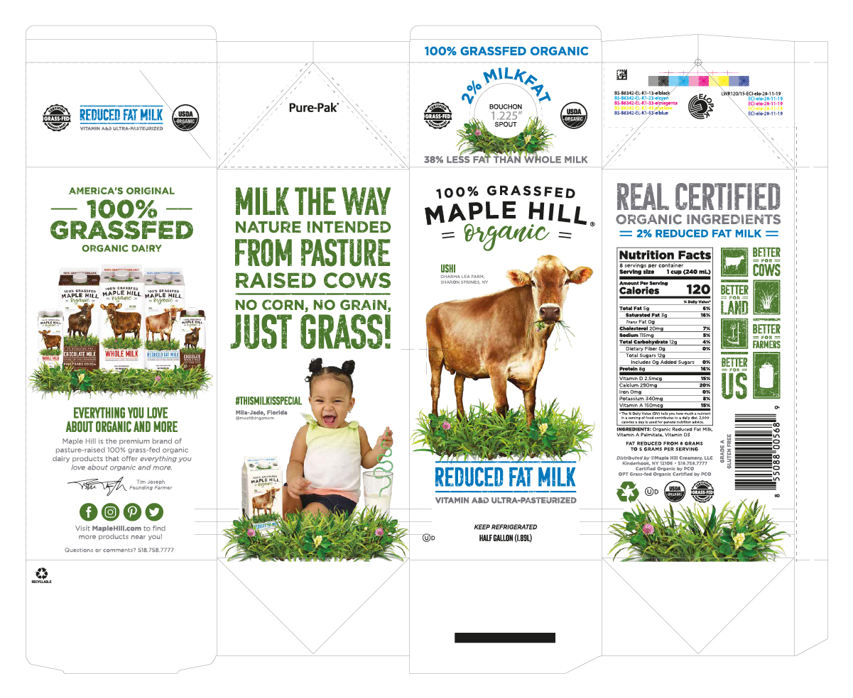
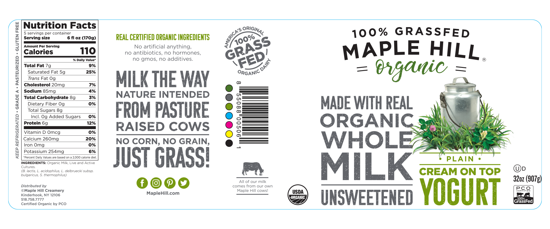
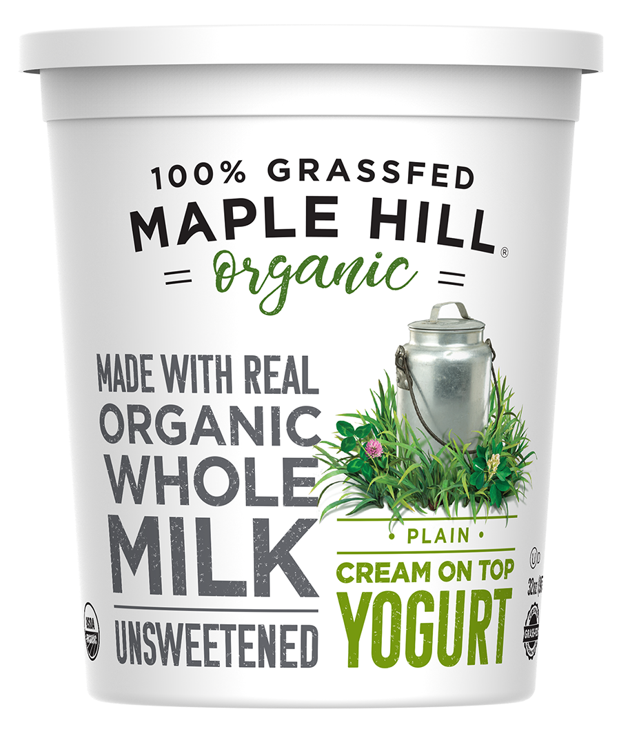
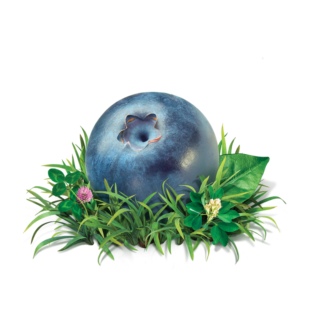
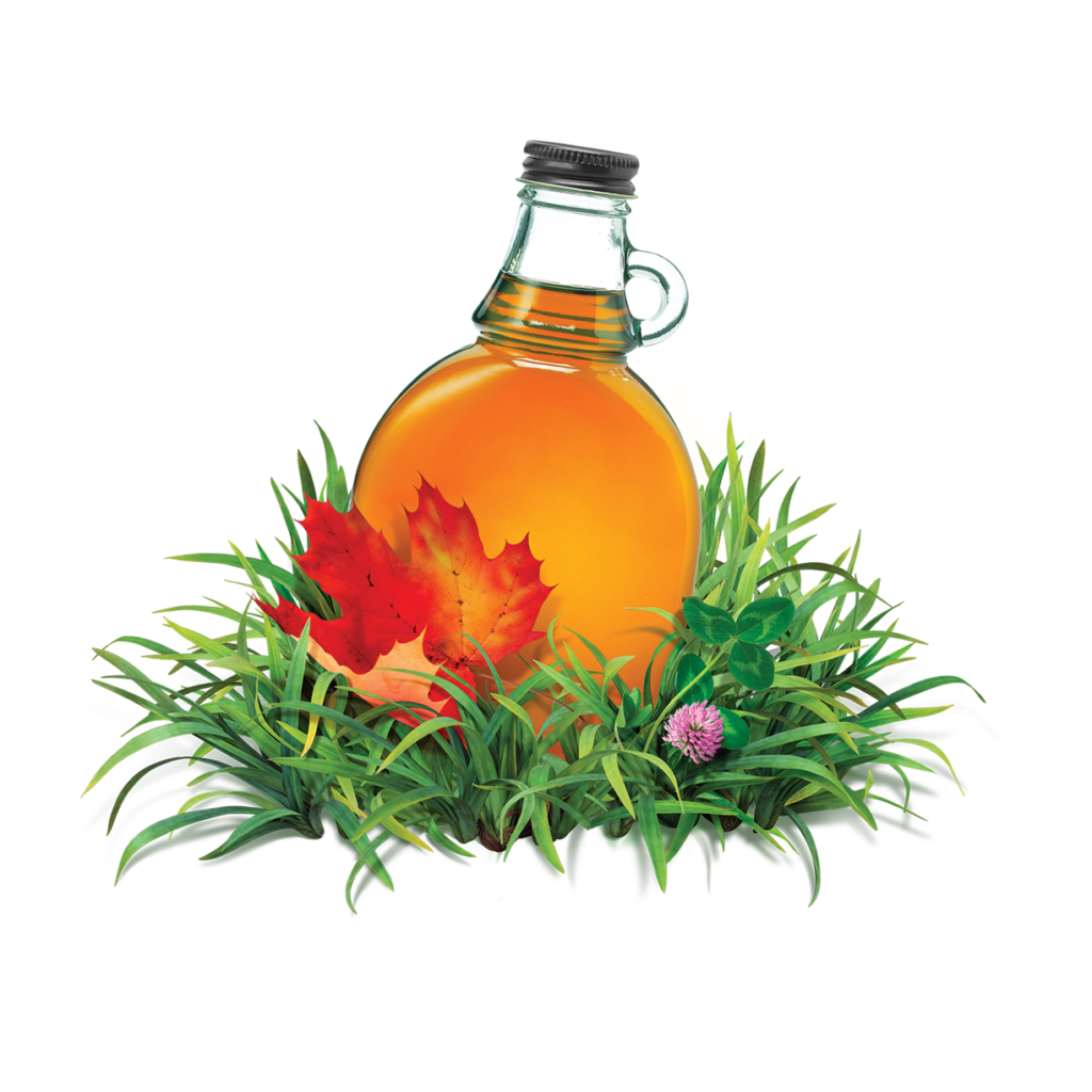
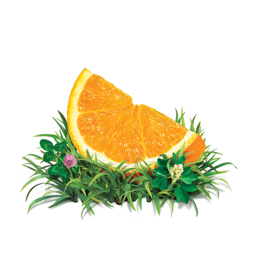
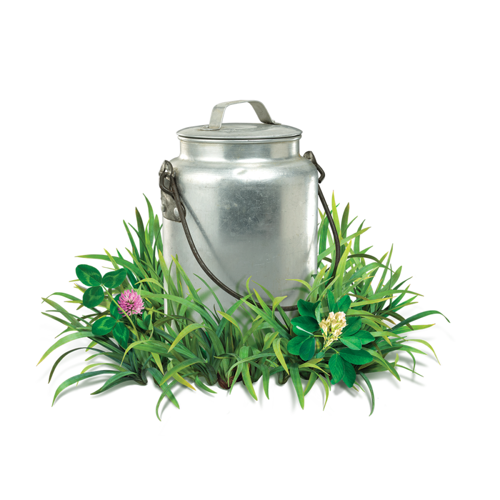
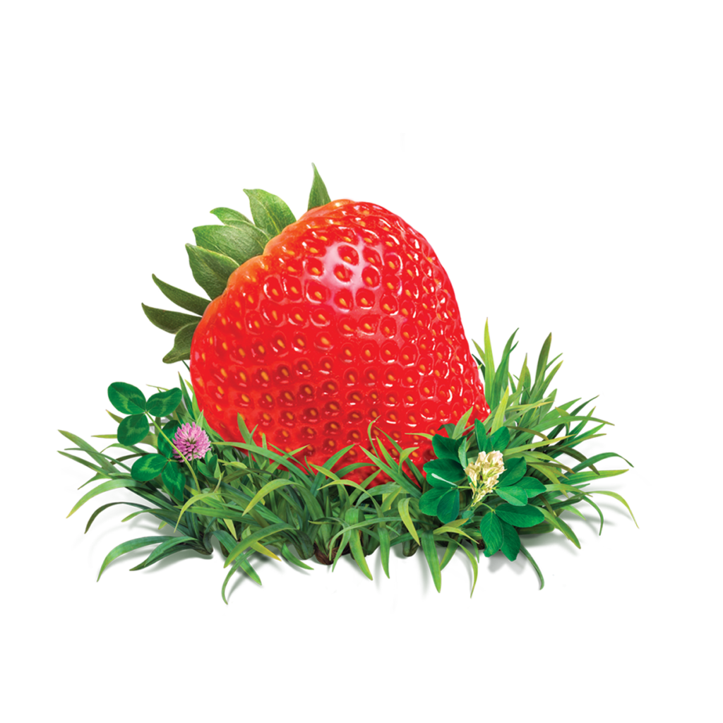
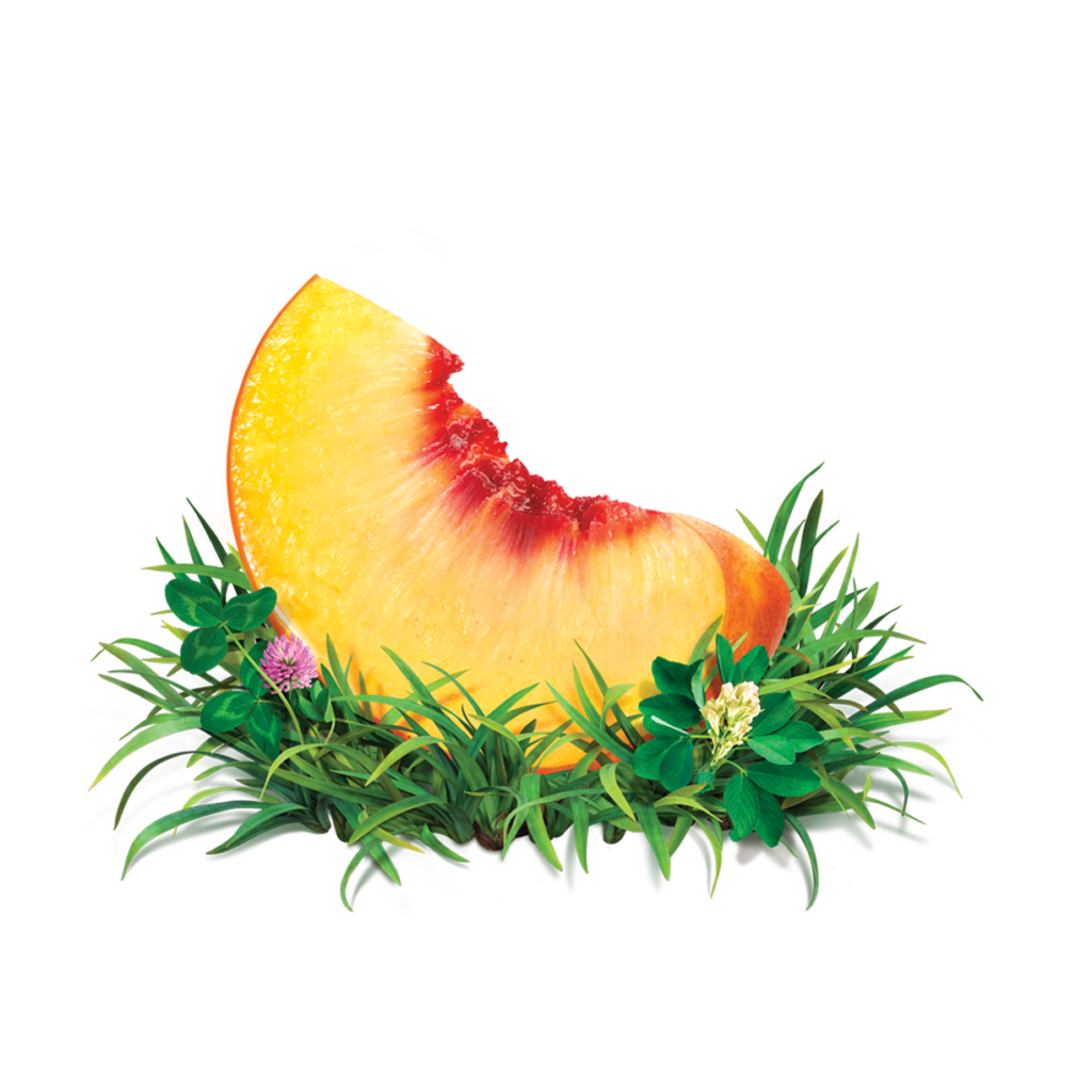
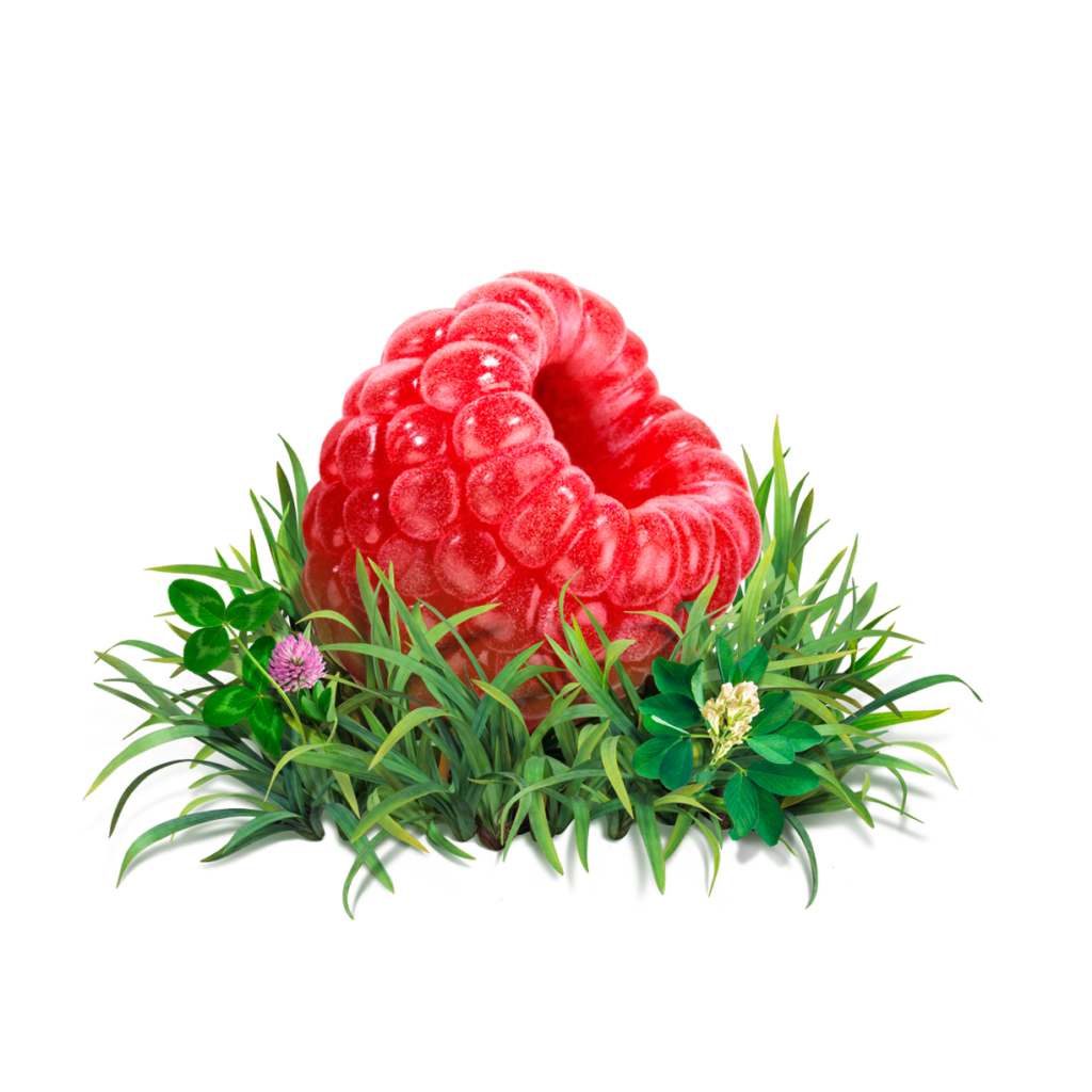
Maple Hill’s positive attitude and integral mission was a dream to work with. They came to us in search of a new brand system and packaging that celebrated grassfed and all of the pros to eating grassfed supplied dairy. We developed a packaging system with imagery of the product; from the cows to the fruit in their yogurt line nestled in grass, the foundation of what the company is all about.
After a few years of the initial brand update we were requested to remove the word CREAMERY and replace it with Organic giving it the hierarchy it needed all along and tweaking the front facing copy but ultimately we stay rooted with our original recognizable redesign.
Where We Started
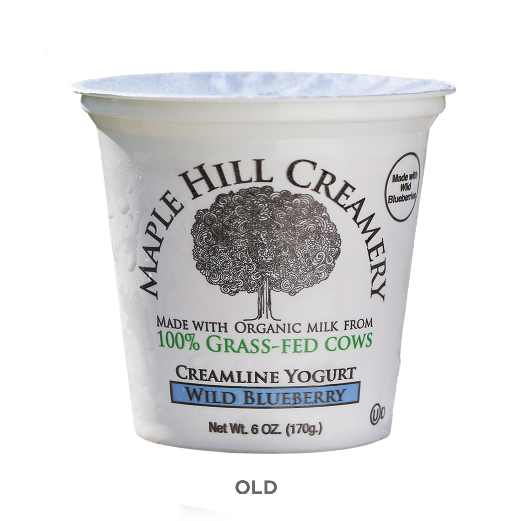
Our initial rebrand started with updating the logo and packaging as an informational based design, educating the consumer of the 100% Grassfed quality. Highlighting Maple Hill and having Creamery as a secondary identifier. The goal was to create a unified branding program that would easily scale as Maple Hill continued to grow its product line, sending a clear message that this milk is special and encouraging consumers to learn more.
Time for Organic


As Seen on Disney’s Wandavision